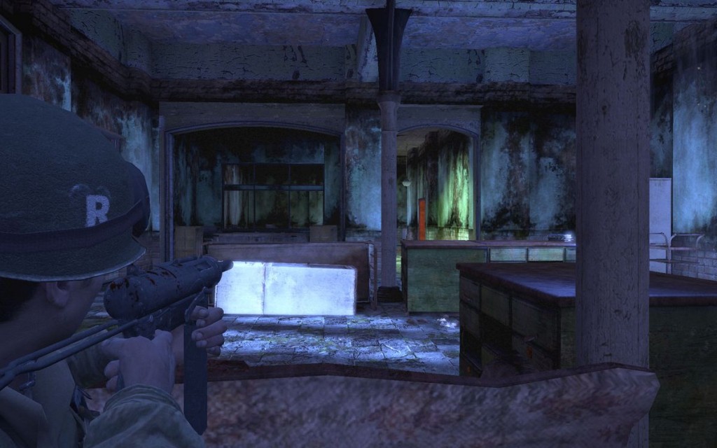
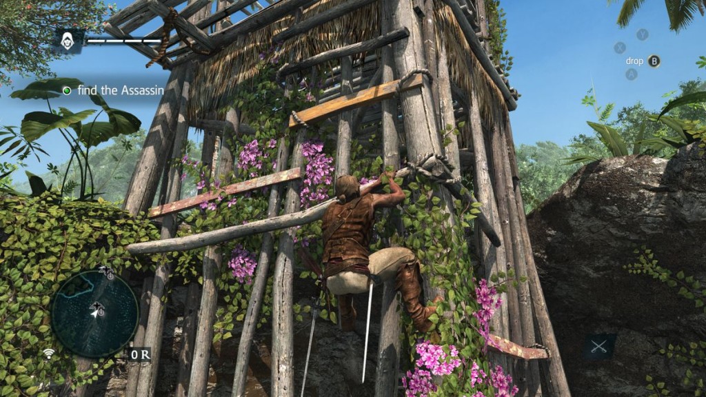
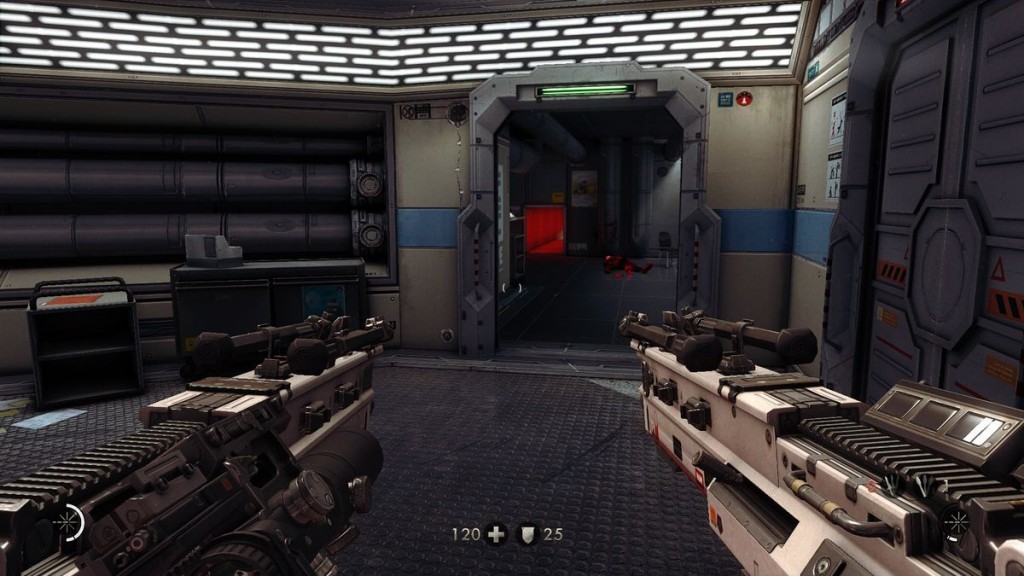
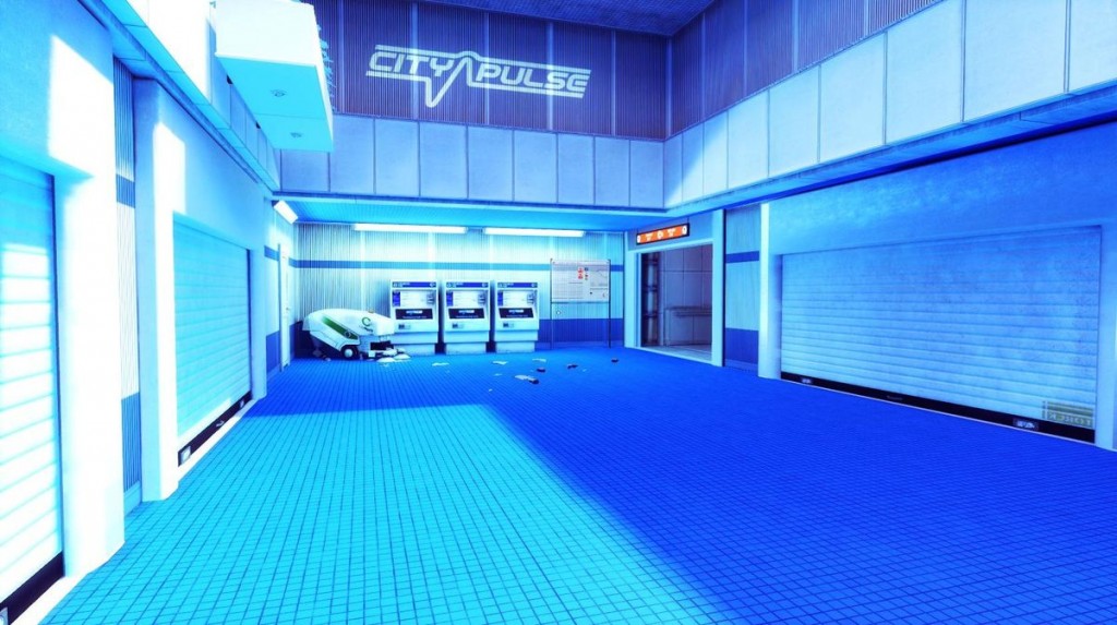
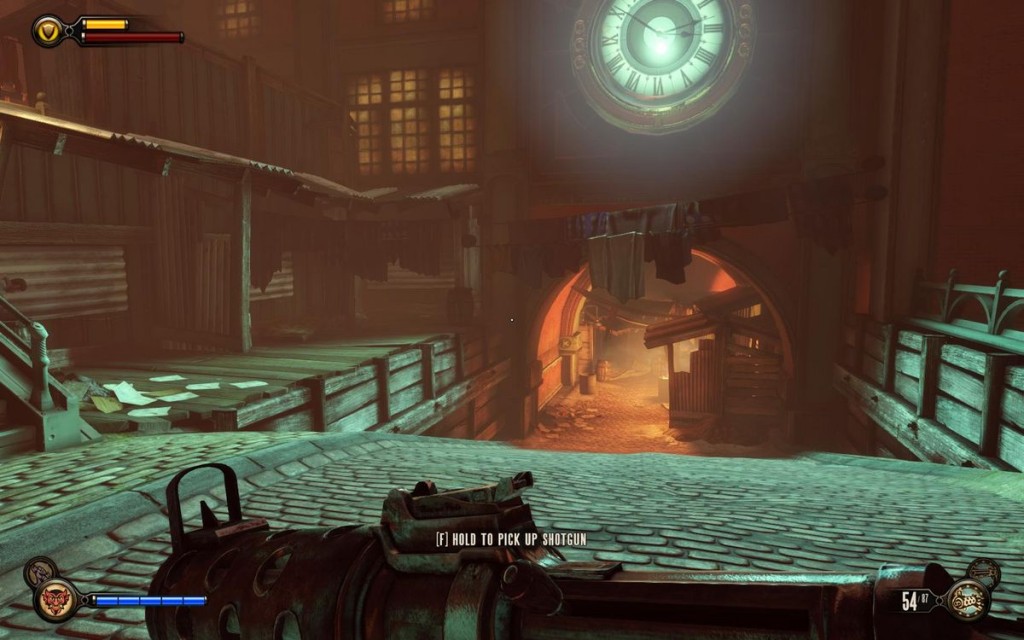
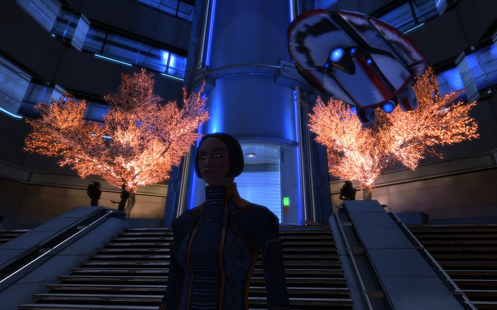
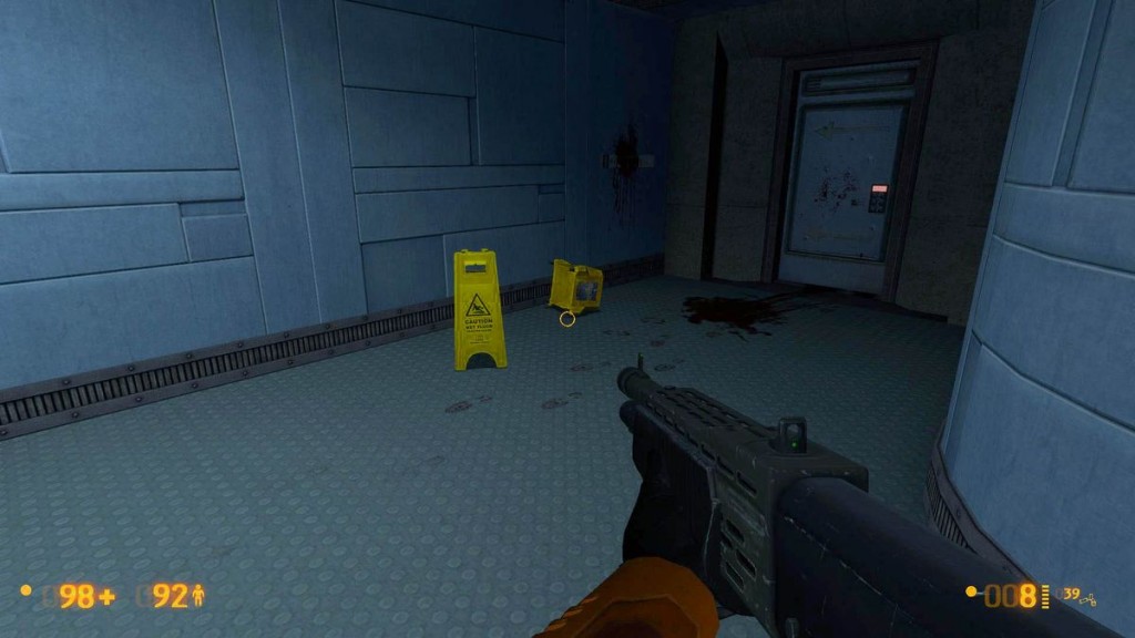
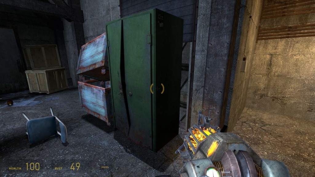
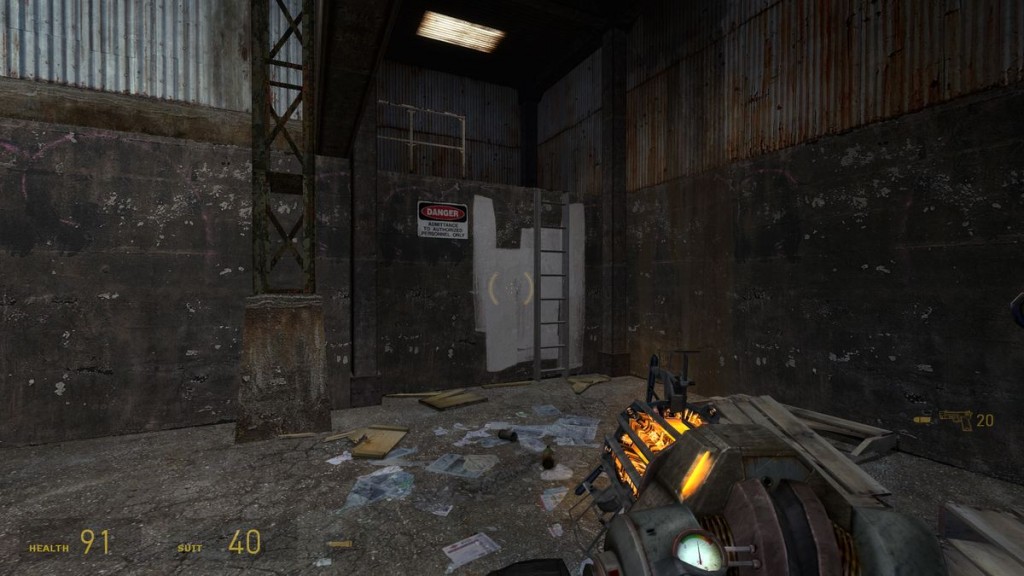
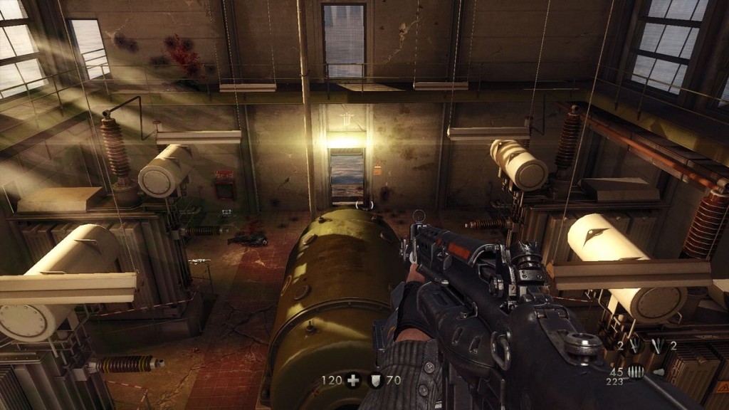
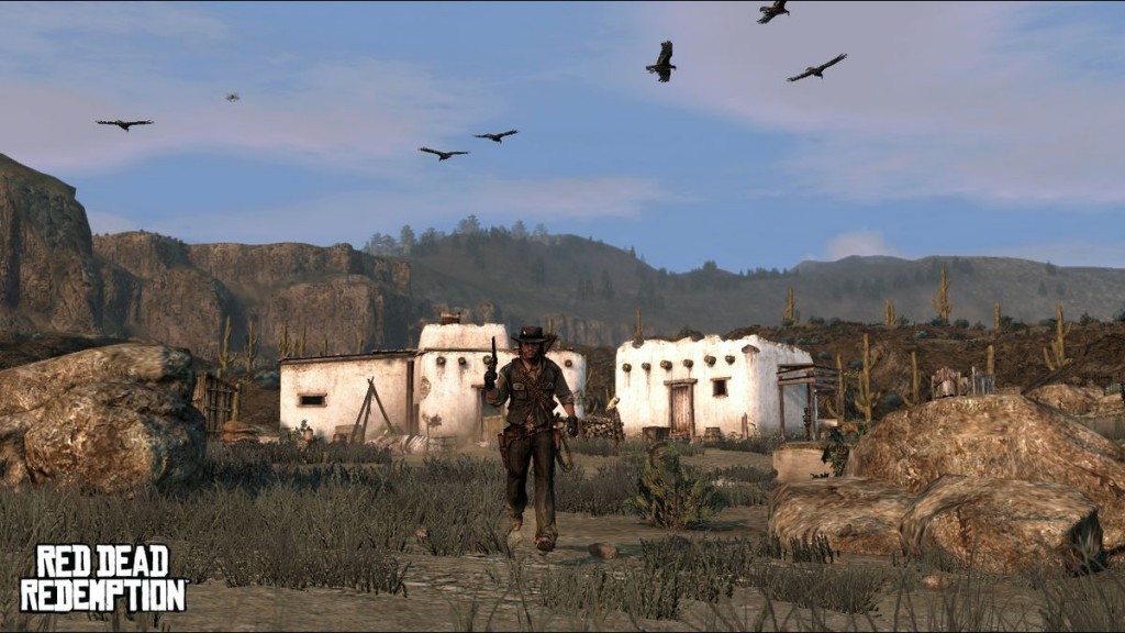
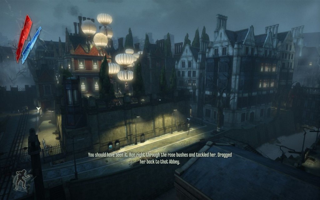
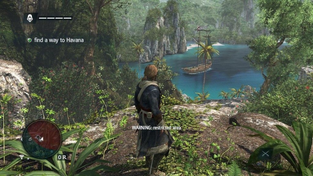
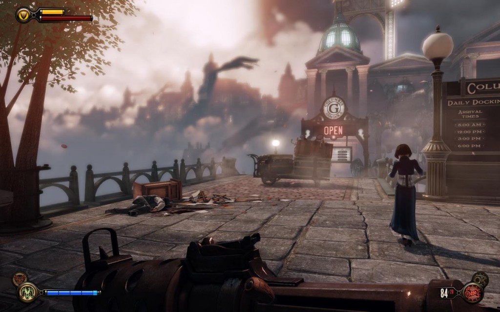
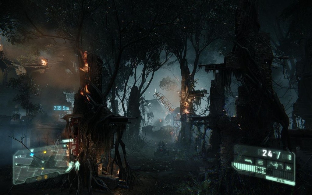
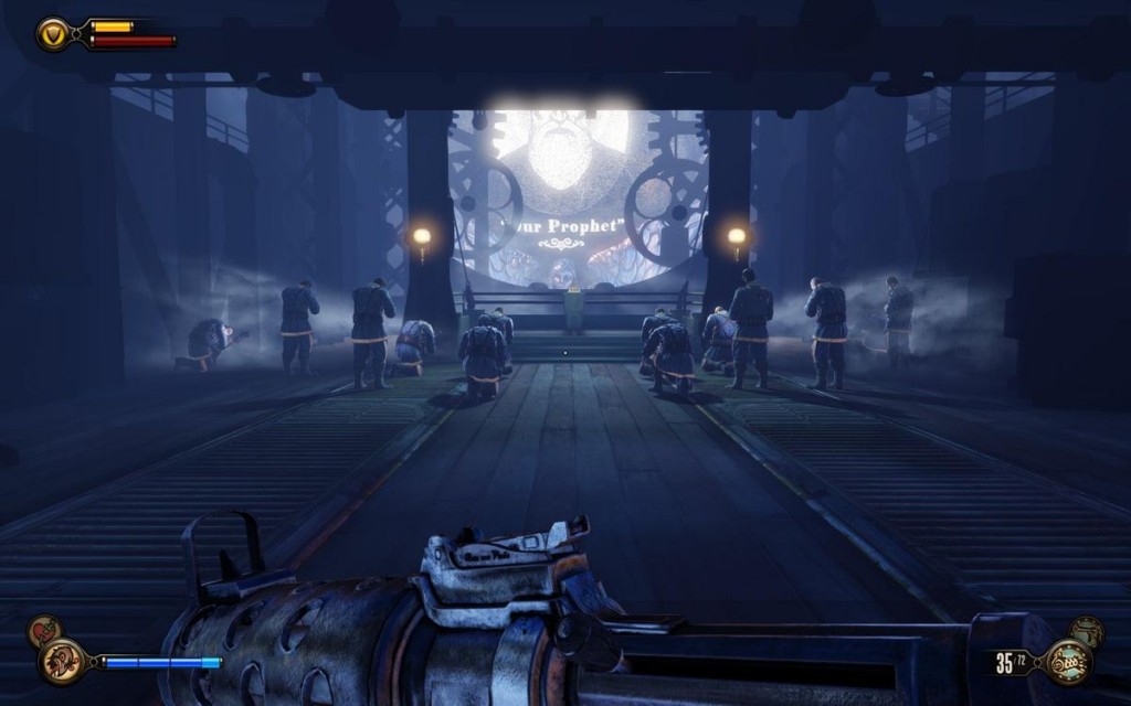
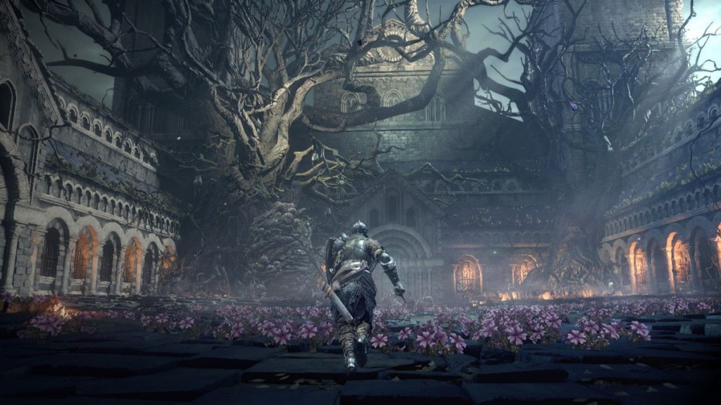
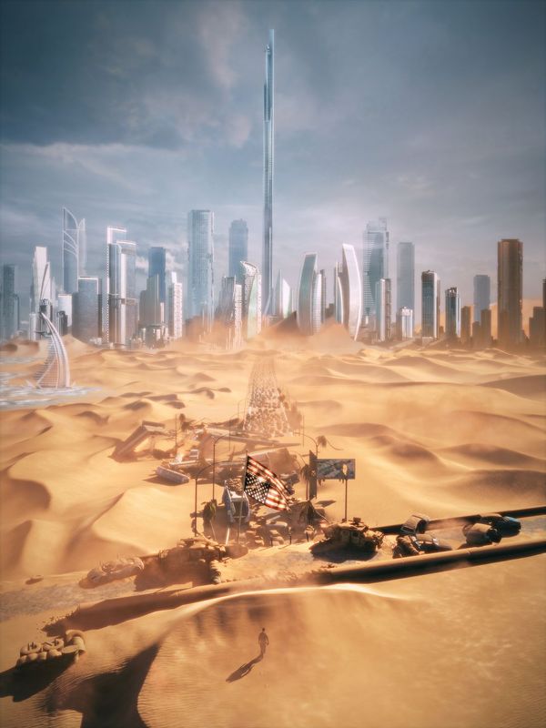
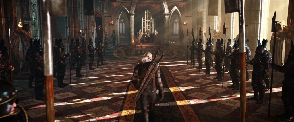
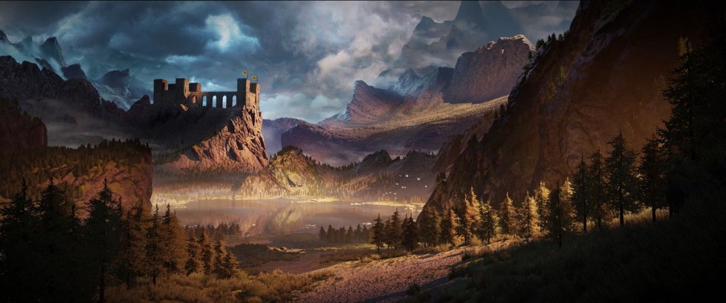
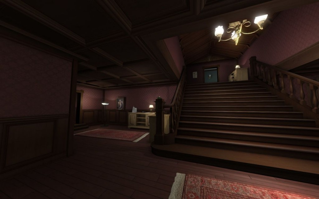
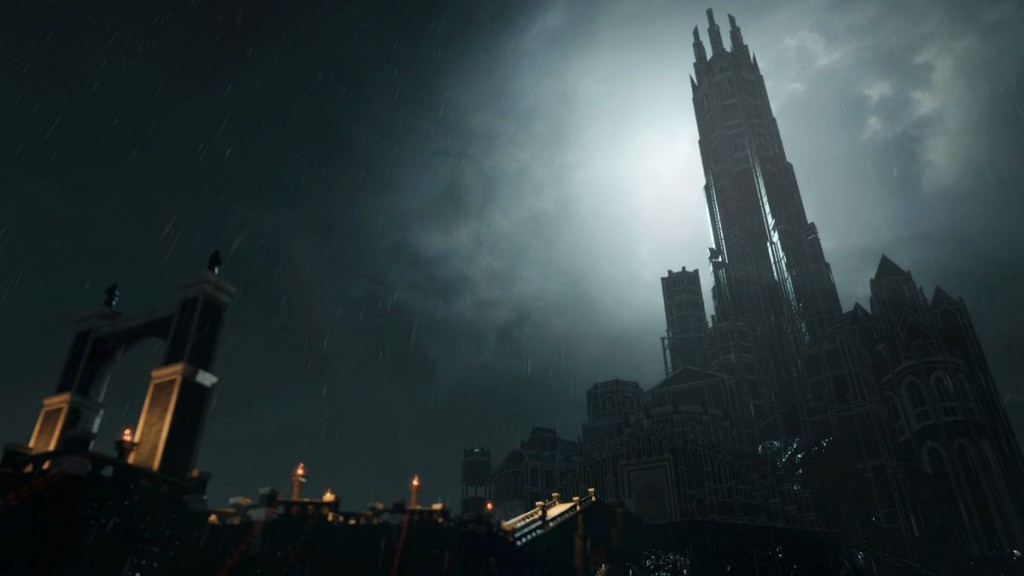
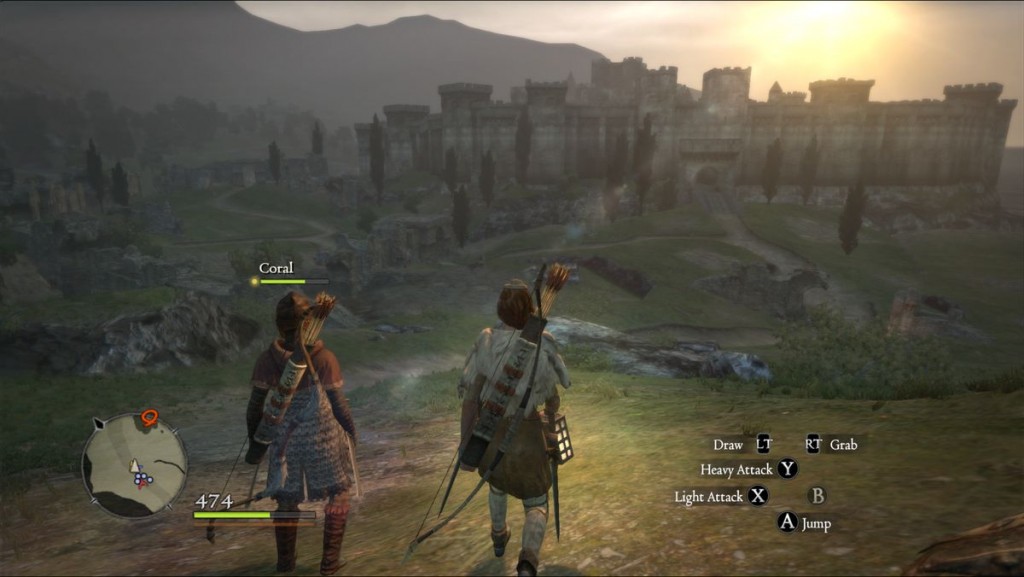
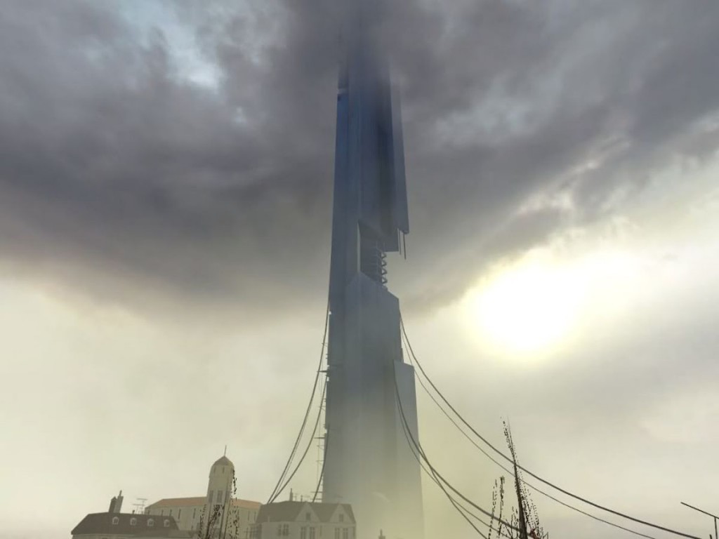
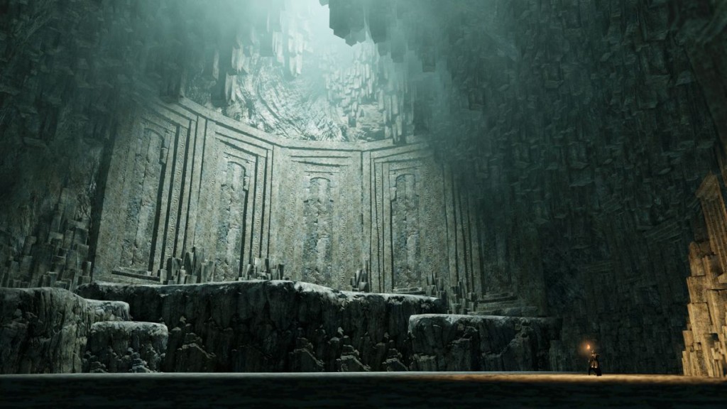
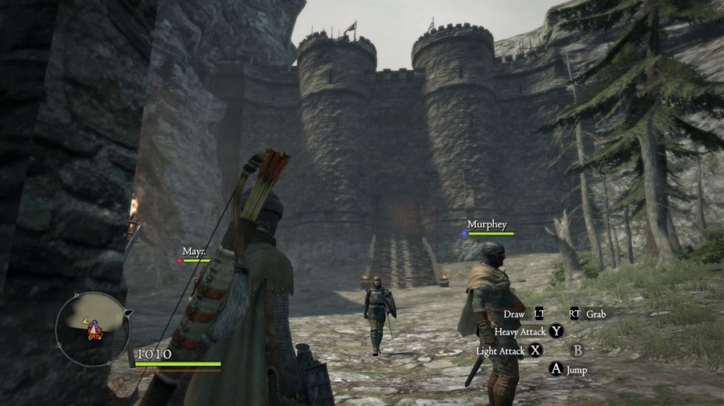
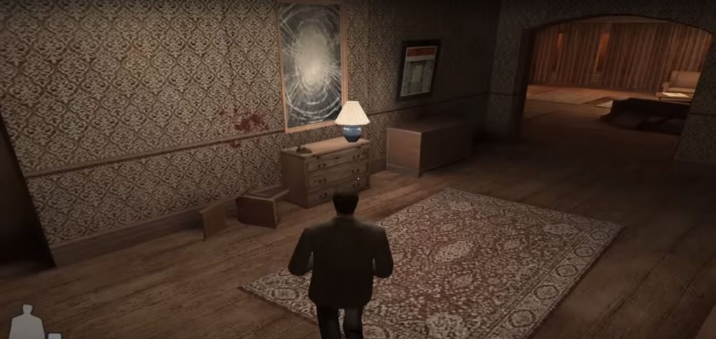
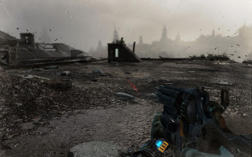
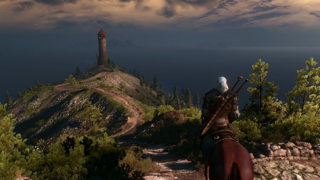
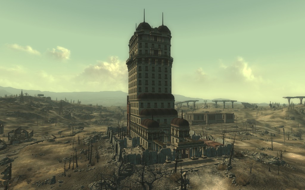
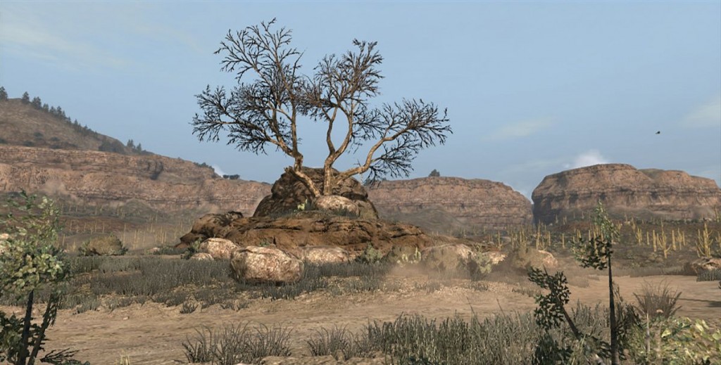
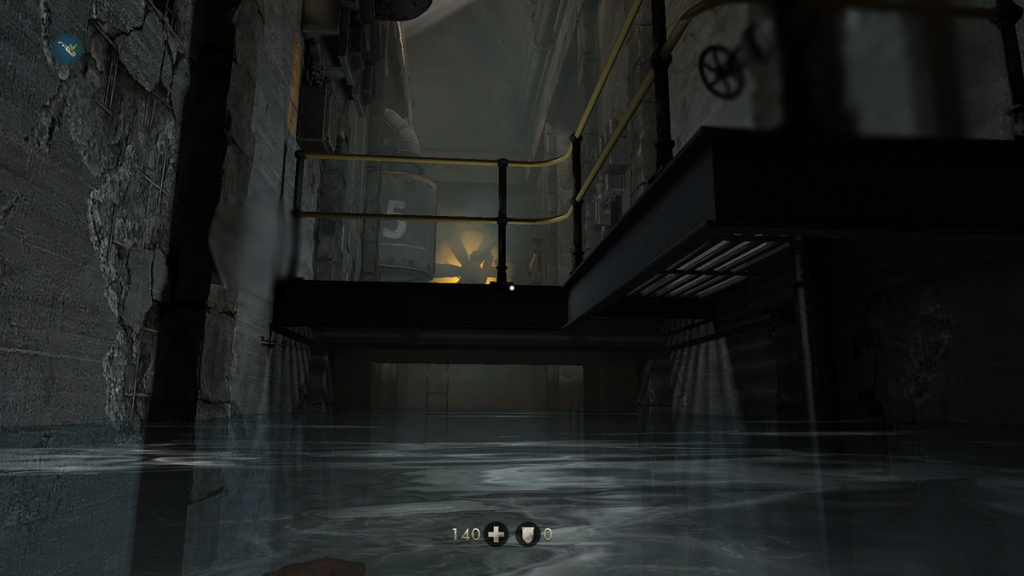
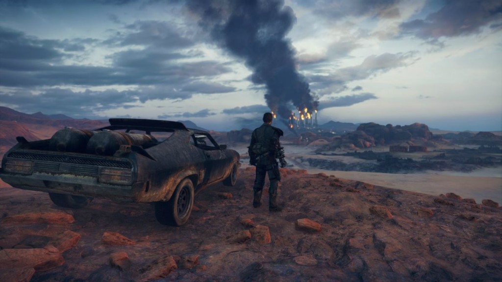
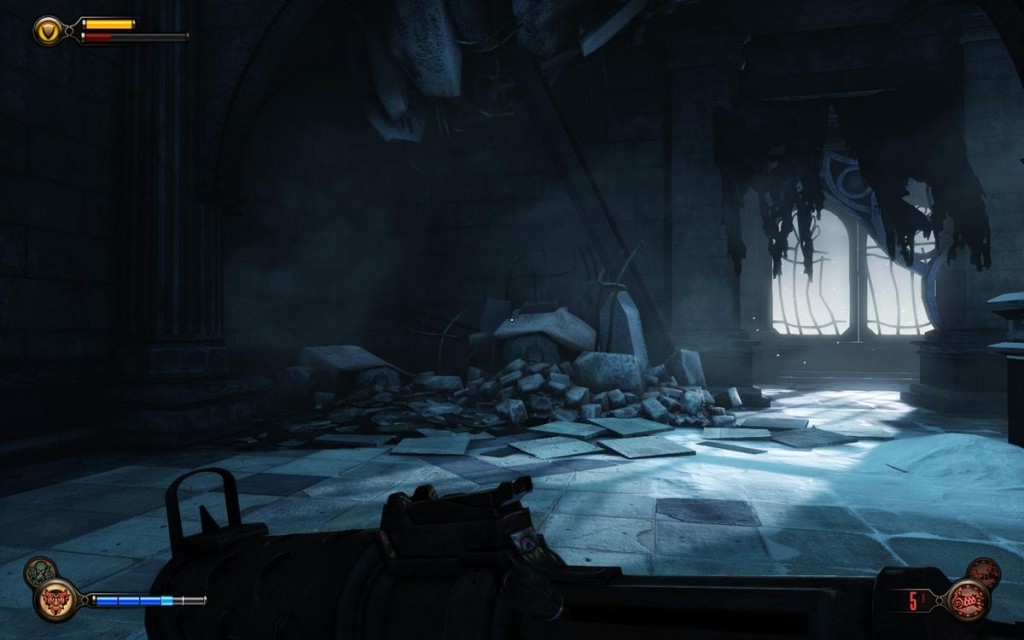
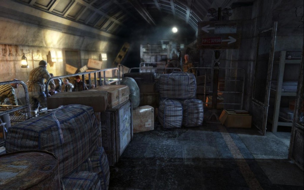
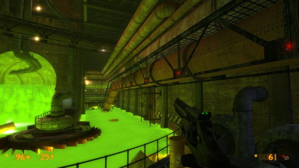
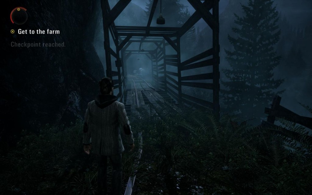
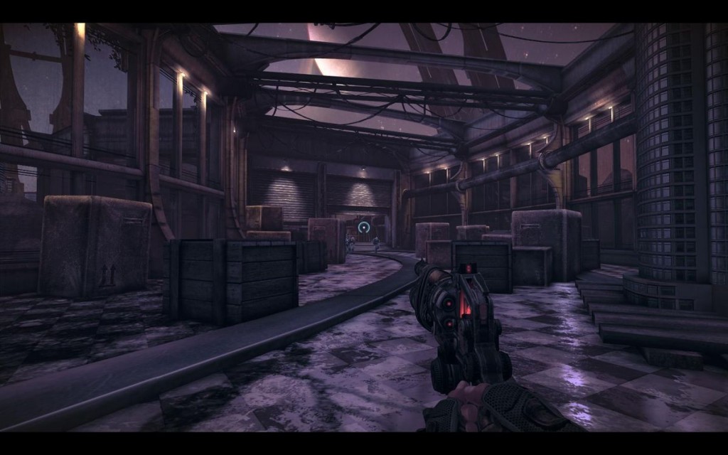
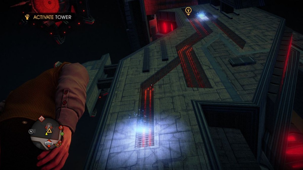
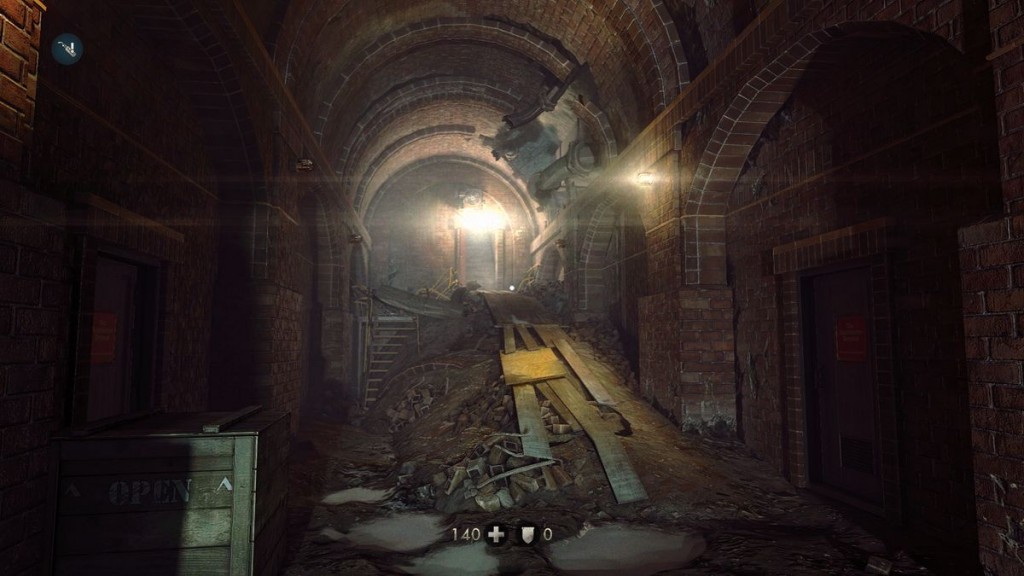
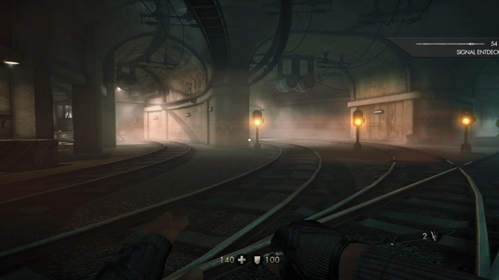
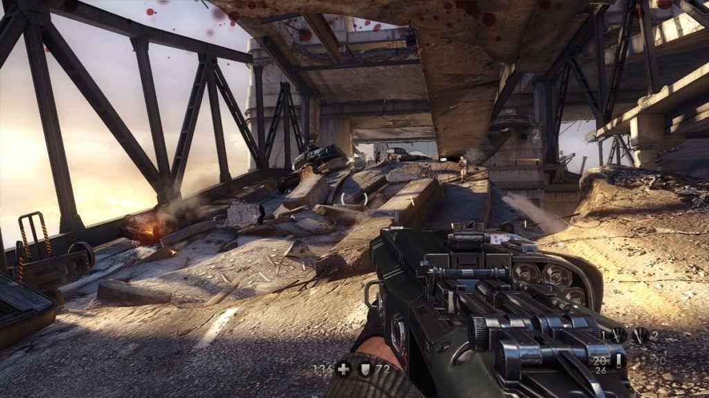
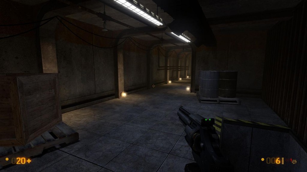
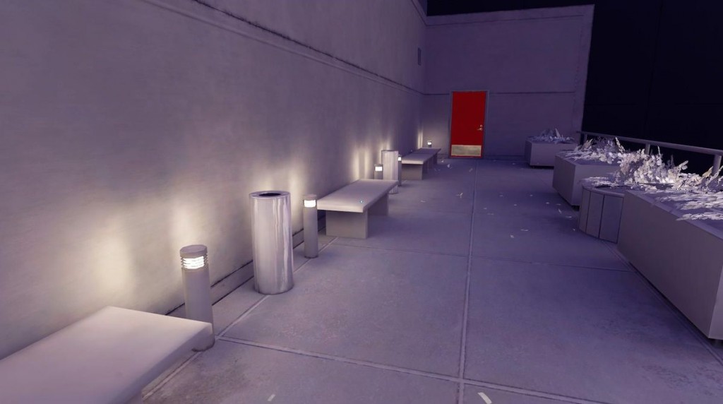
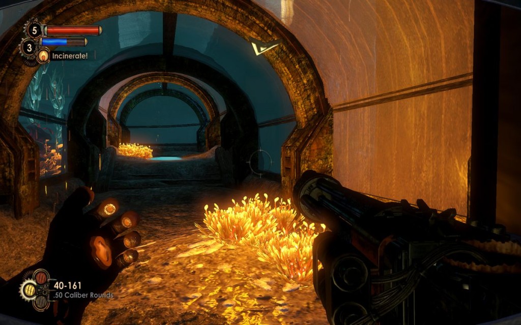
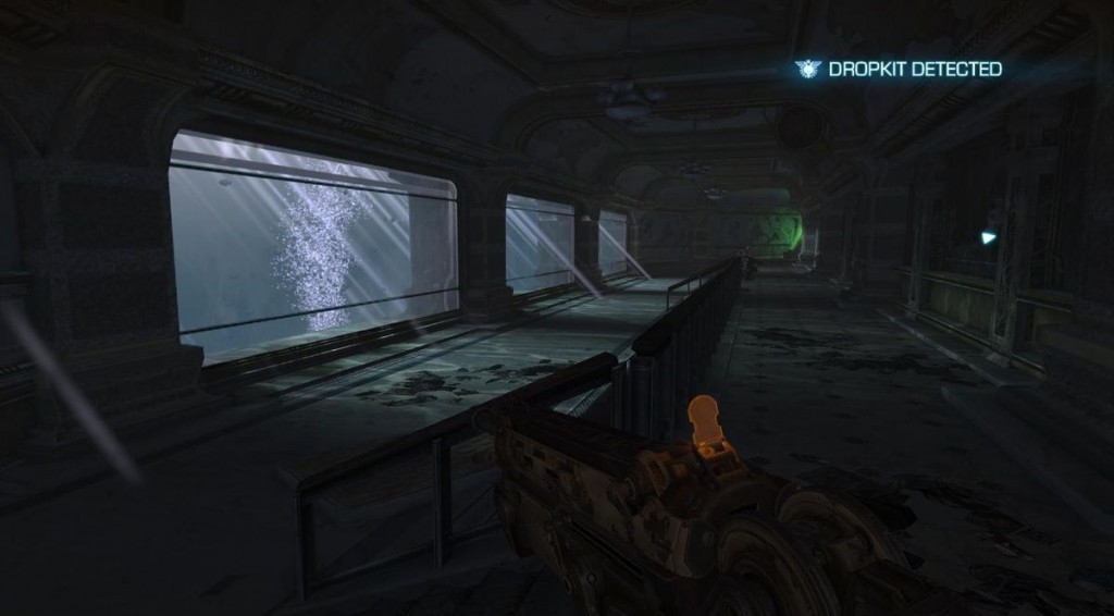
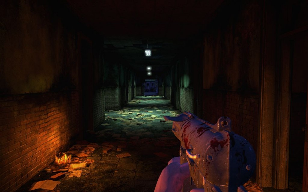
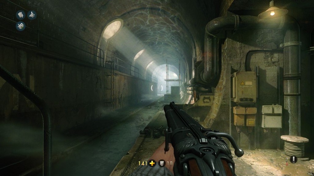
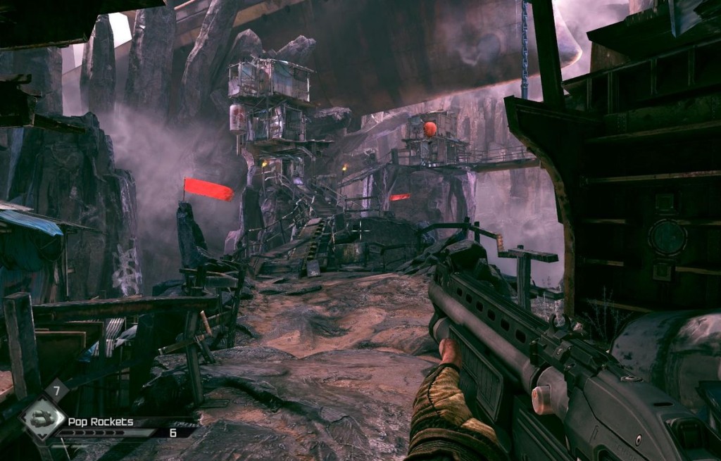
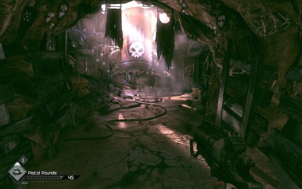
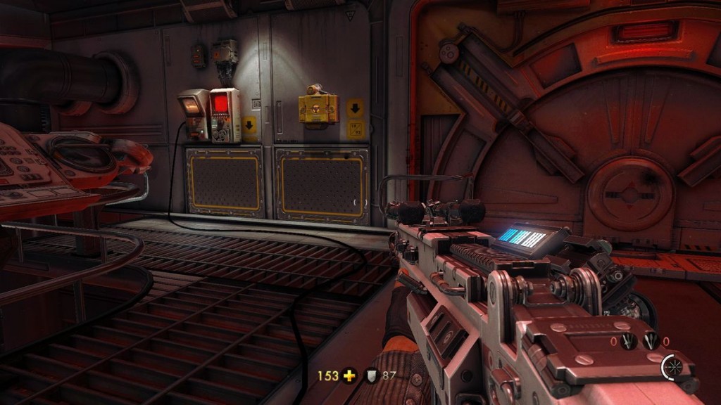
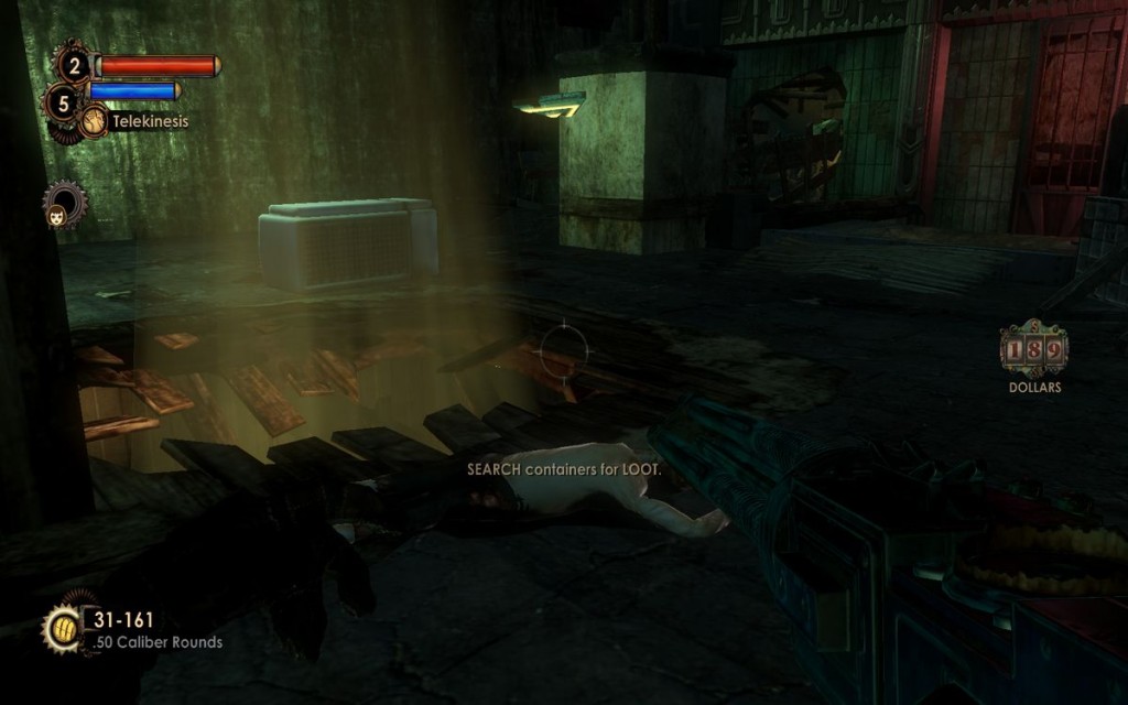
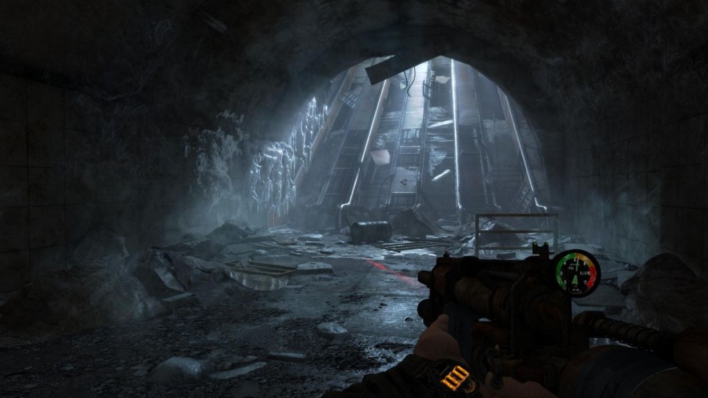
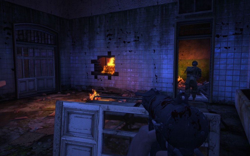
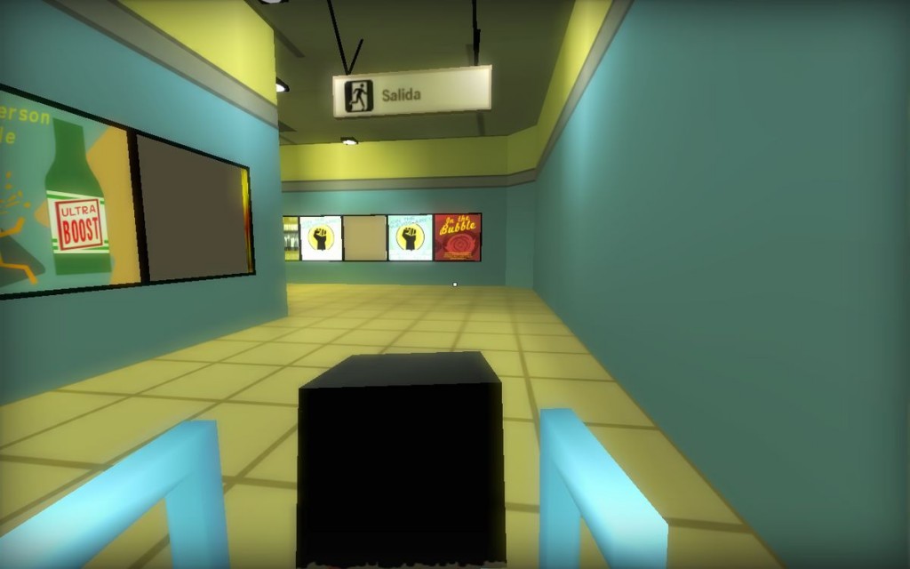
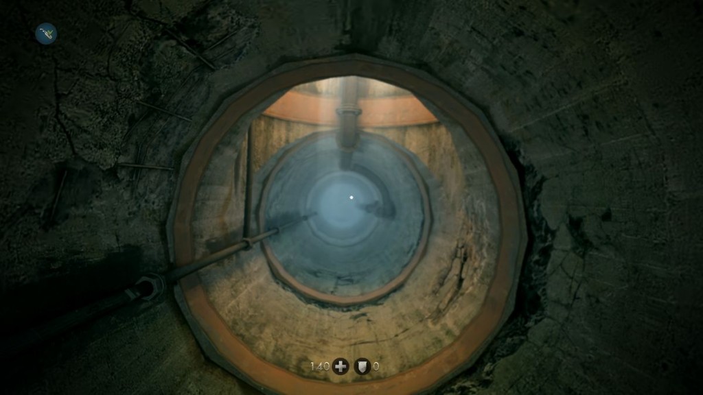
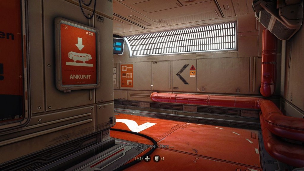
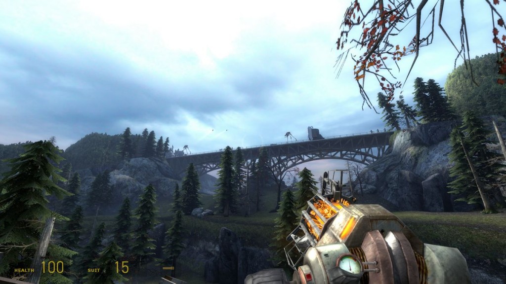
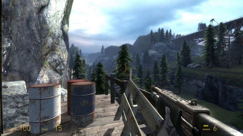
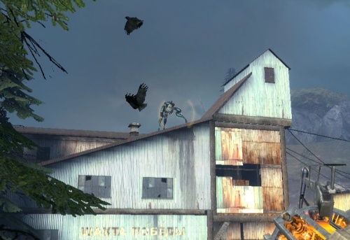
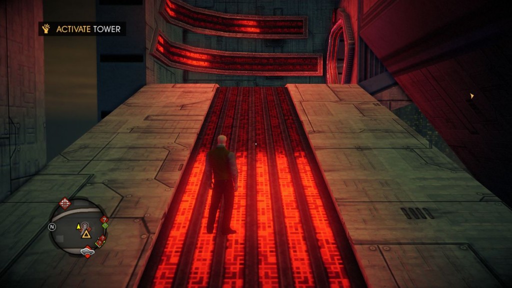
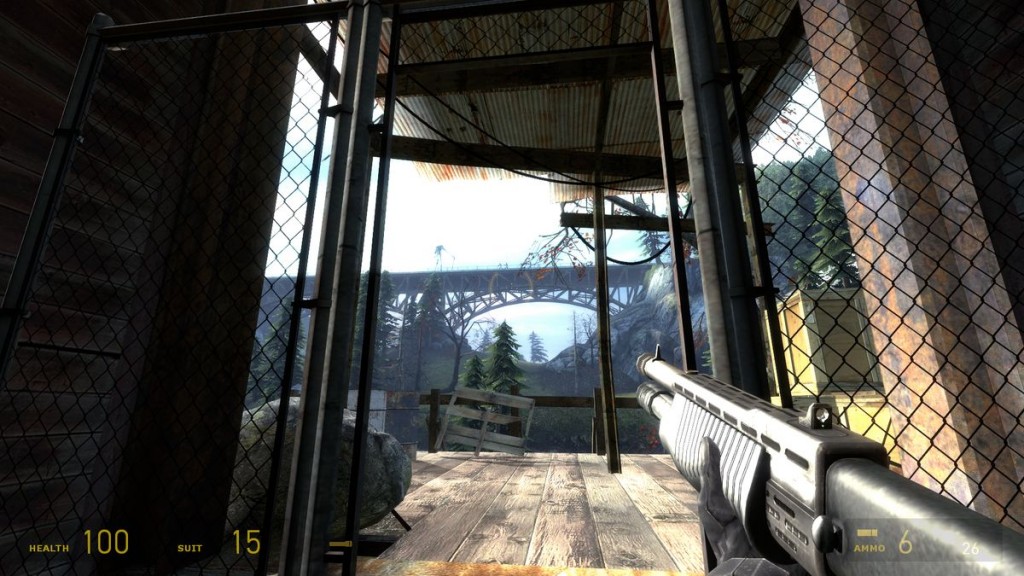
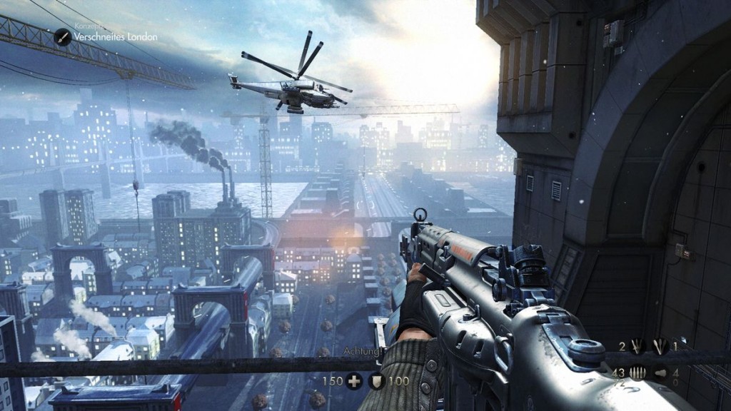
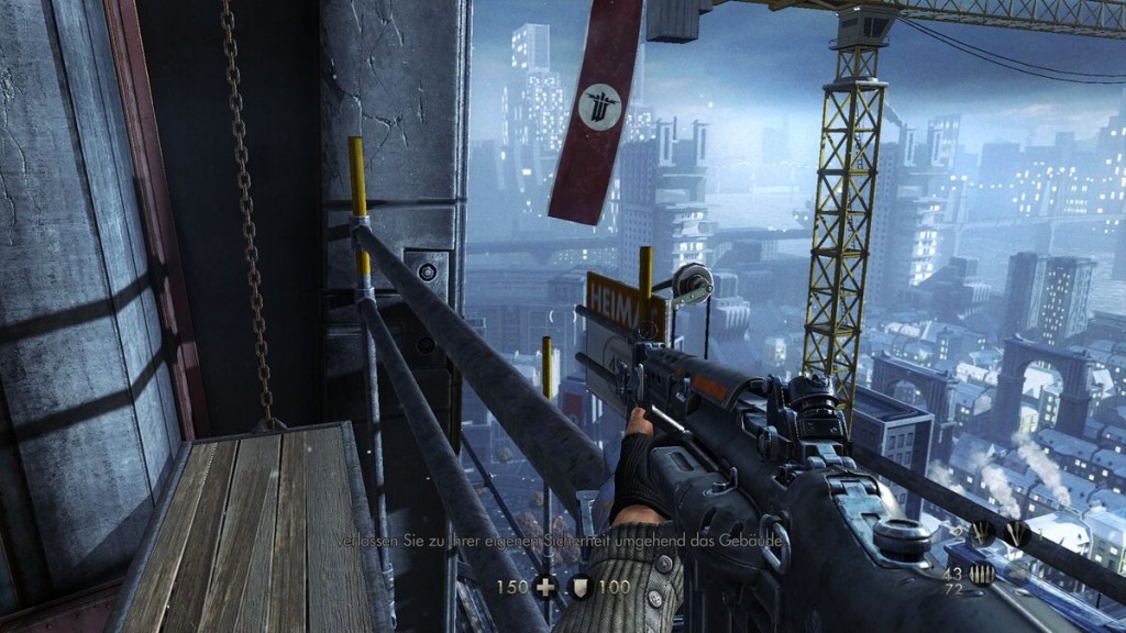
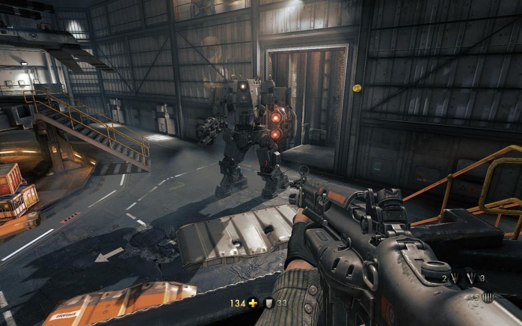
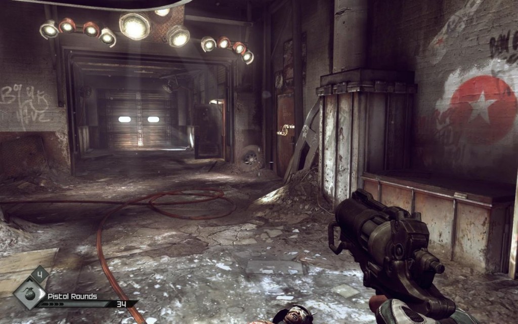
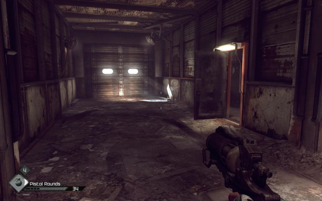
The layer above allowing the player to build a mental model of your level is to influence what he looks at and where he goes as subtly as possible through the composition of your scenes. The excellent thing with composition is that it is sort of already ingrained in people: you don't have to establish any sort of language or convention for it to work. It is very effective and most often quite cheap to pull off. In some cases you also need to know when and how breaking composition can benefit your level design, for instance to create tension or unease, to add interest or to encourage the player to pause and consider his options.
Mateusz Piaskiewicz puts it well in his article "Composition in Level Design": he compares moving through a game to the act of moving from painting to painting in an art gallery, presenting the player with a series of compositions. I may paraphrase here some of what he already presented but my approach has a slightly different focus: to build upon his comparison, I have as much interest here in the paintings themselves as in the design of the art gallery and how it drives the viewer along.
Composition is a big complex subject, and you should dig into the vast amount of literature available from other art forms. It is also important to realize that 3D, dynamic virtual environments are unique in their own way and sometimes require different approaches than those other fields have mastered before us (although architecture shares commonalities with our work.)
My problem in general with composition is that most documentation about it is pretty dry, and it's only by observing, comparing, experimenting and practicing that I manage to develop my understanding of it (and photographers or movie directors will have a lot more to say about it than I do.) However, the good news is that even though I'll still bring up a few abstract concepts, for the most part it should be pretty concrete and straightforward when applied to game navigation.
1. Basic concepts
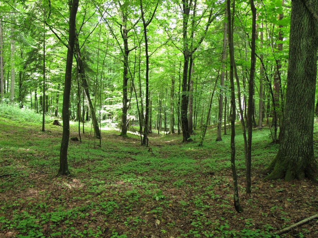
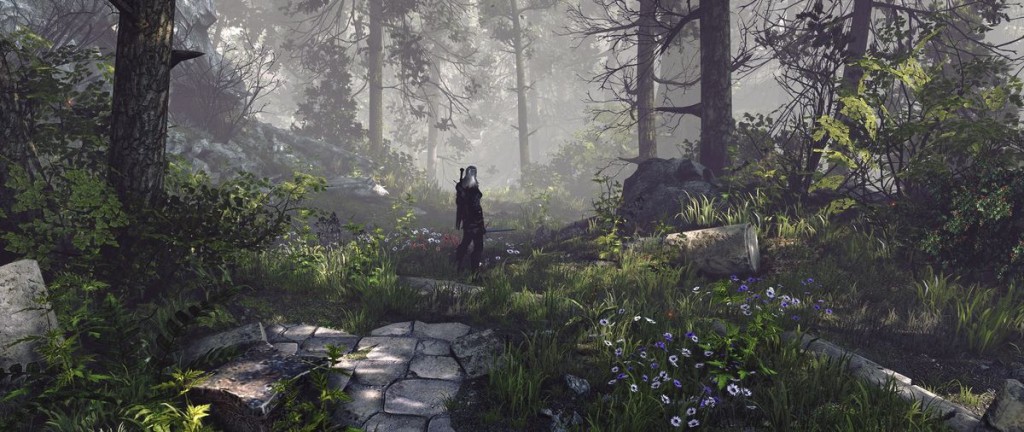
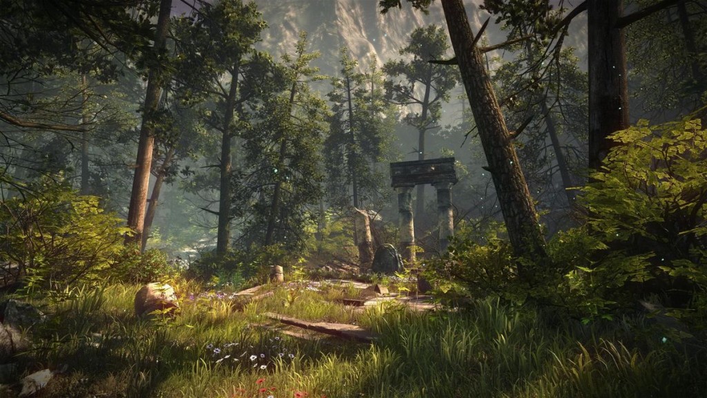
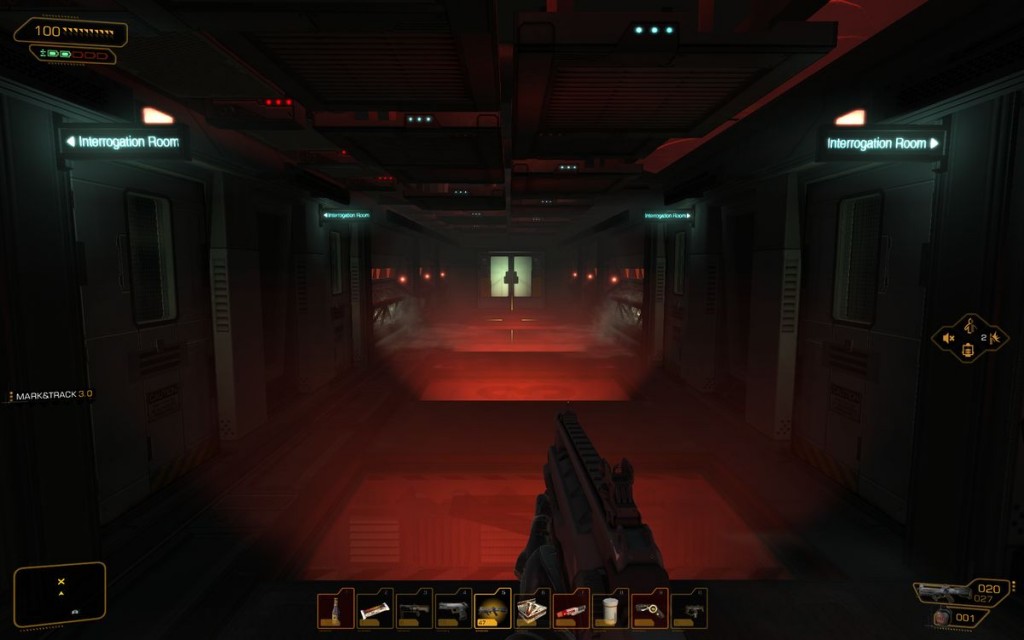
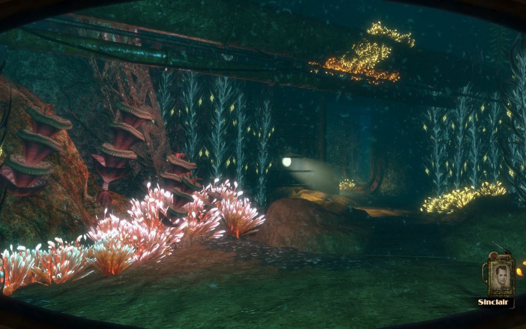
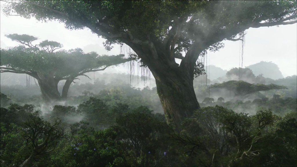
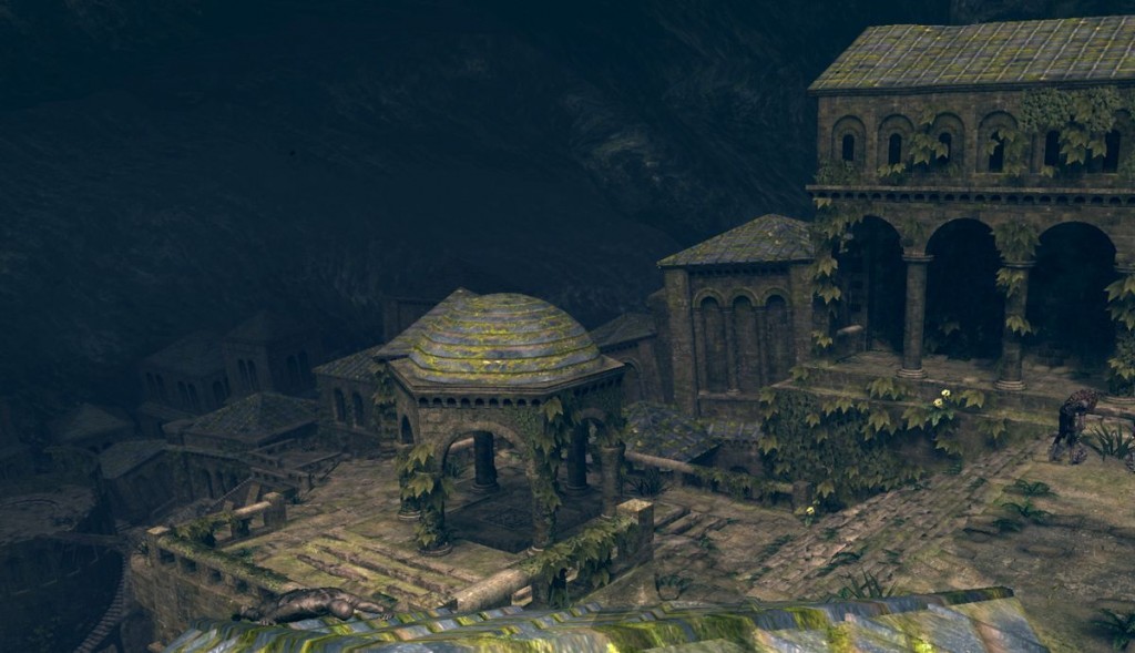
Unity is the quality obtained when all elements of a composition were designed and disposed in a logical and pleasing fashion, without any of them battling to look important, all of them being compatible with one another, and fitting the theme. In practice, unity without variety can be fairly boring unless you're going for a minimalist art style. But variety breeds chaos if not balanced by a sense of unity! Hitting that balance between the two is what allows life to breathe through a scene, making it both pleasing and interesting. To illustrate the point, let's consider a forest environment. Here's one that certainly has unity, but lacks variety, and thus interest.
Similarities between elements (e.g. scale, color palette…) can allow them to fit together harmoniously, but you can create interest by tweaking some characteristics of subjects to create emphasis. Contrast is a very cheap and effective way to make certain elements of a composition stand out, and to draw the player's eye to a center of interest if there is one.
The center of interest is a point that attracts the look and dominates the entire scene. It must catch the eye first, then progressively lead to satellite elements in order of importance. Most of the composition techniques mentioned below contribute to defining the center of interest of a composition, and usually more than one tool is needed to do so.
2. Constrast
Let's consider how to add emphasis, but remember that emphasis is great but should not be used haphazardly: excess of contrast generates monotony, and repetition of the same contrasts in any given composition tends to diminish their effect.
Color
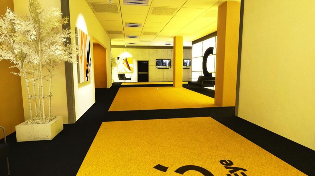
Colors with opposite characteristics contrast strongly when placed close to one another. The further away colors are on the color wheel, the higher the contrast, complementary colors having the highest contrast of all. In practice, we consider colors contrasting and complementary much more laxly than in color theory, so you don't have to always go for the absolute opposite for good effect. Use this type of contrast appropriately and moderately, or your scene may become noisy and unappealing, or tweak other color characteristics to allow contrasting color hues to blend together into a cohesive whole.
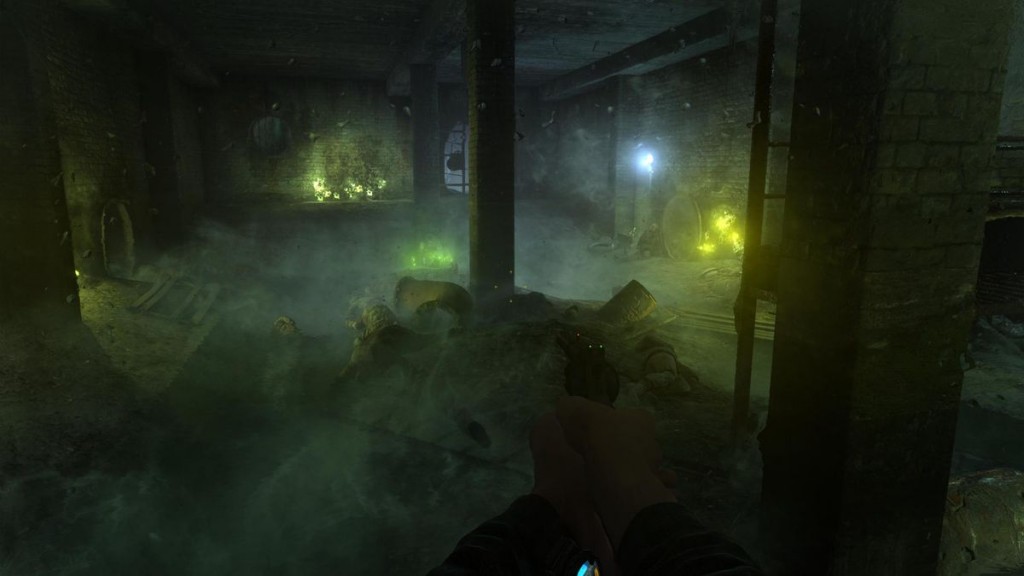
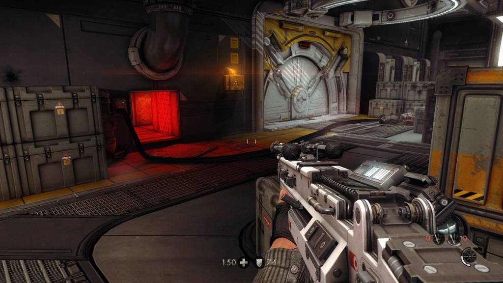
Warmer colors tend to appear closer and pop out more from a scene than cold colors, which tend to seem more distant. Useful when you have a dominantly cold environment (e.g. the gray/blue/purple interior of a spaceship) and want a certain element to really pop out (e.g. yellow control panels.)
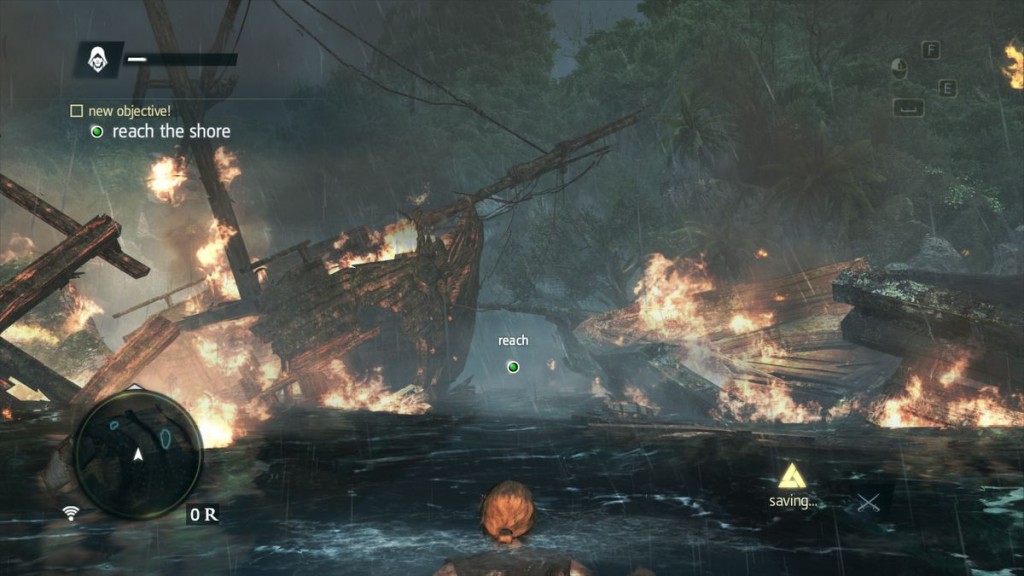
In general, a saturated color (more intense) is more visible than the alternative (more gray). A bright object is considered more striking than a dark one, and the gap between brightness and darkness is more important than the gap in value (e.g. a bright blue object or light source in a dark blue environment will catch the eye more than a dark red object). For instance, white is generally combined with black in road signs, but yellow juxtaposed with black is used for warning signs because it is more effective, as the gap between brightness and darkness gets added to the difference in hue difference.
Light & dark
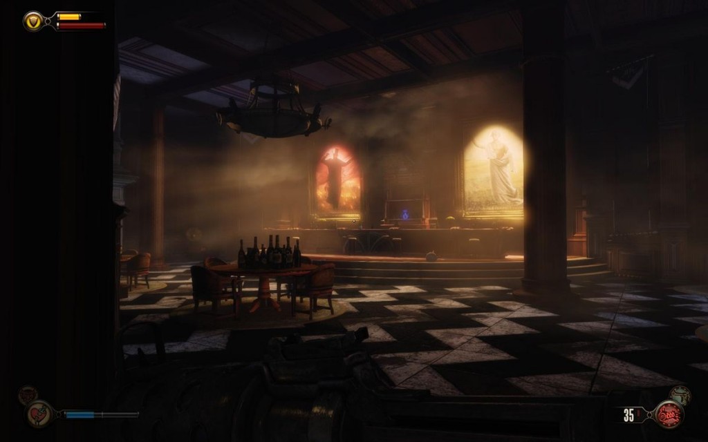
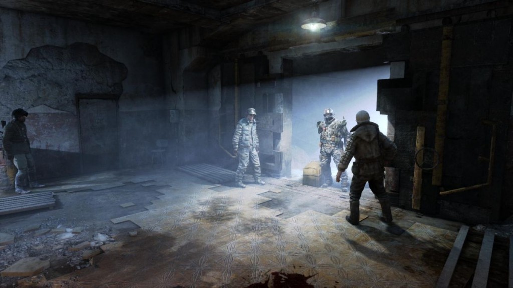
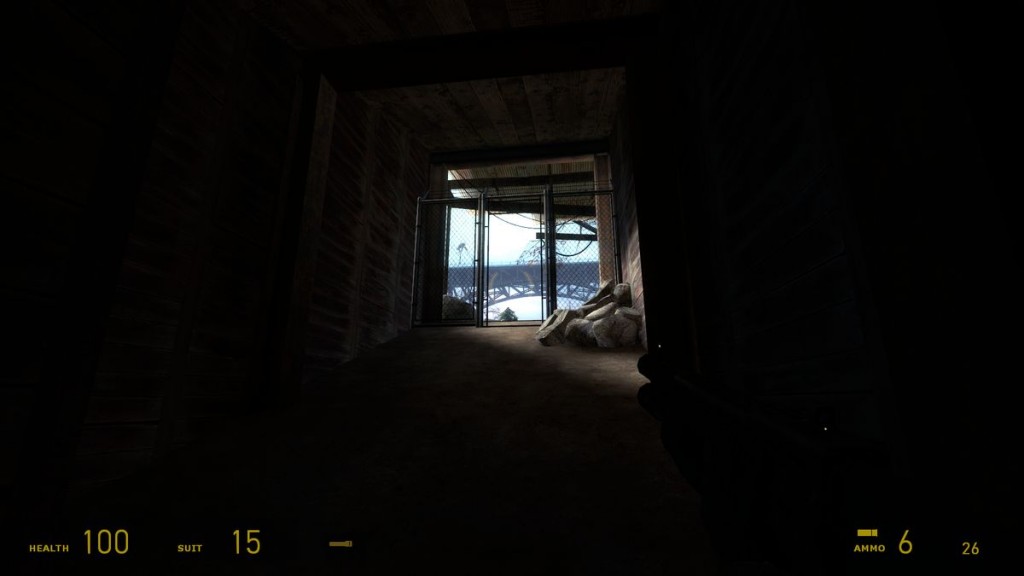
Lighting is by far the most used trick in the list, and clever lighting alone can drive a player through a whole level. The flexibility of lighting means that it is related to, or provides a way to implement a good part of the composition tricks listed below (e.g. color, lines, motion…), so I'll only focus here on the contrast between brightness and darkness in a scene.
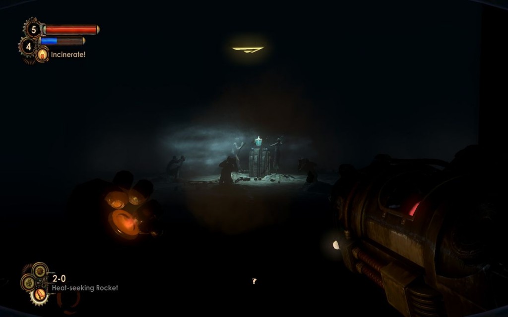
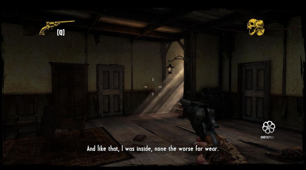
In classical arts, Chiaroscuro (italian), or Clair-obscur (french), refers to the use of strong contrasts in light and dark, allowing the unimportant parts of a composition to fade away to let the focal points come out even stronger. The brighter the light, the more the dark parts tend to disappear from view. Also, standing in a bright light can make the darkness around it appear almost like a wall or part of a different space, a concept used particularly well in many survival-horror games to make leaving bright safe zones scary in itself.
Negative space
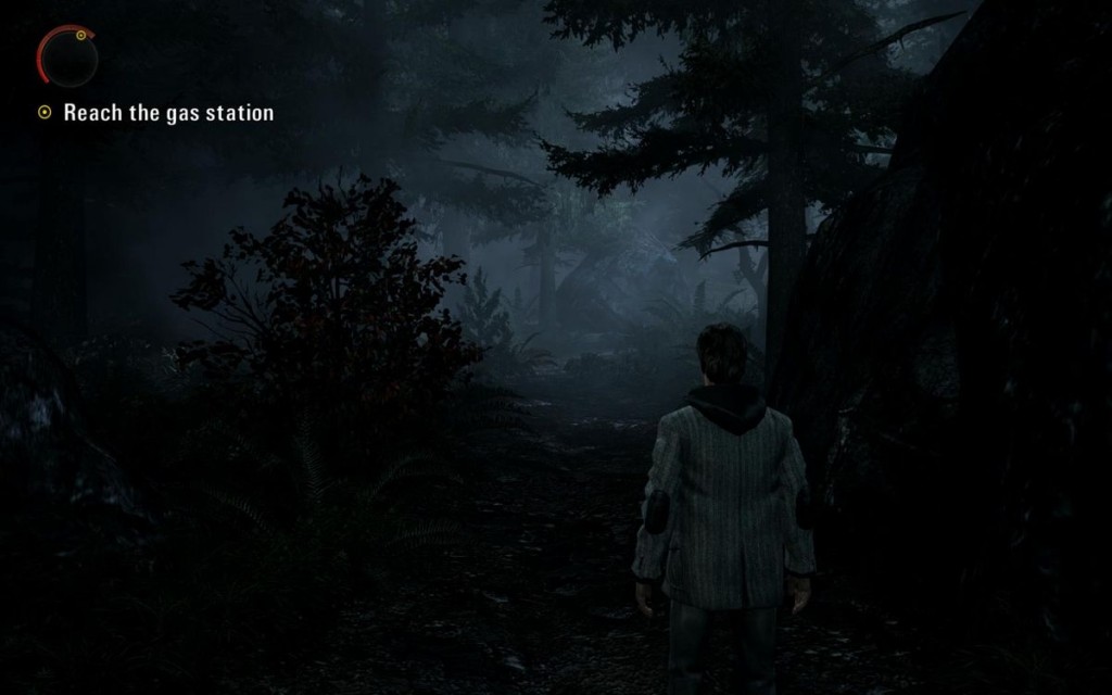
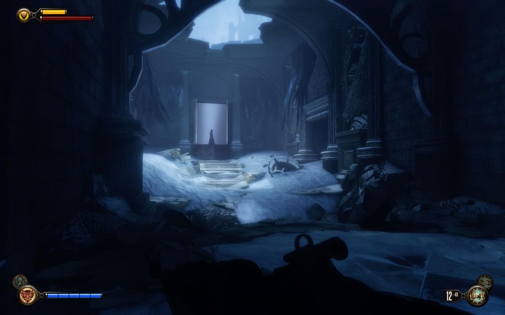
The contrast between light and dark described above ties in with the concept of negative space. The name refers to the space around the subject of a composition (the positive space). But in this case I'm focusing on the use of negative space to increase emphasis on the subjects. The more fuzzy, empty, out-of-focus, dull, dark… the negative space is, the more the subject takes importance in the composition. In the example of light & dark, making the negative space pitch black results in focusing more intensely on the light areas; and using a contrasting background can make a subject's silhouette stand out sharply.
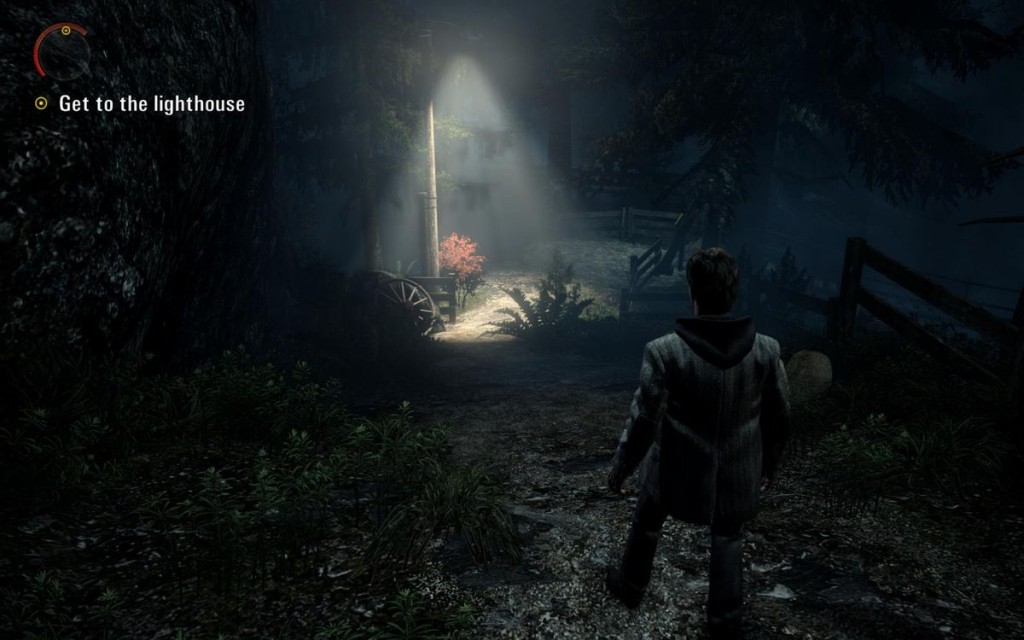
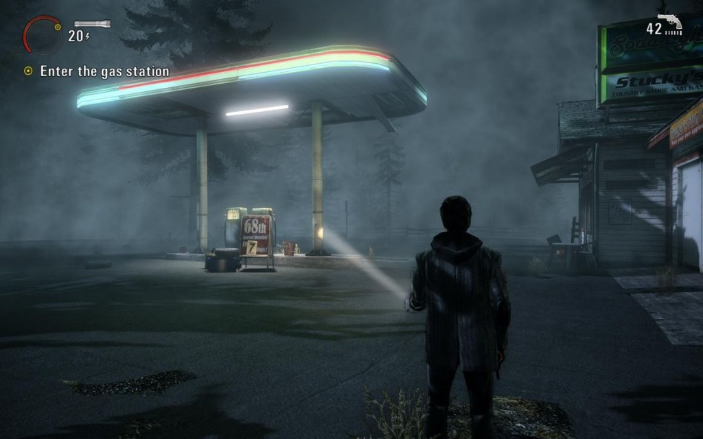
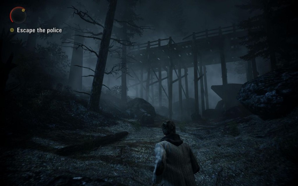
However, bear in mind that for a pleasing composition it is recommended to naturally balance negative and positive space, so it may be a good idea (depending on your game) to not boost the importance of the positive space too much. Alan Wake is a game I feel did an excellent job playing with that balance: when traversing a forest, the canopy of trees acts as negative space that focuses the player on the positive space, but only in certain situations (and on purpose) does the positive space really dominate (e.g. to focus the player's attention on a save-point) so it remains powerful throughout the game.
Framing
A frame is an area within the player's field of view that is defined by the composition, usually to highlight a subject in that scene. Seeing through a doorway or window is a sort of framing, but it can of course be much more subtle (e.g. the silhouette of trees framing a path) or obvious than that (e.g. an arch above a path)
Closed shapes possess a faculty to catch the eye, as generally done in advertising by placing frames around commercials, and that's what framing tends to do. It also relates to negative space, as in most cases what's contained within the frame becomes the positive space and the rest the negative space.
A common way to use framing is to funnel the player into some sort of narrow passage that faces an important subject (e.g. a cave tunnel of which the exit is aligned with a massive tower in the distance, a boss standing at the end of a corridor, etc.) but framing comes in a wide variety and is found pretty much everywhere in games.
Proportion
Proportion is the relation of the dimensions of each component of a scene with the others as well as with the whole scene. A shape has correct proportions when the size of its parts generates a harmonious relationship with the environment. Very different dimensions placed side to side lack coherence: a piece of furniture can be pleasing in its shape, color and texture, but if it doesn't fit the rest of the furniture and the dimensions of the room, it will look out of place. A vast space will accept bigger furniture, larger patterns, more intense colors and sharper contrasts.
As surprising as it may sound, proportion is often more important than color when designing indoor areas. The skill of the eye to perceive shapes and proportions is more developed and varies less from person to person than the ability to distinguish colors. Colors also have different meanings depending on the individual, but shapes provoke similar reactions on everybody. So an object of exaggerated proportions in an otherwise harmonious environment will be instantly visible; use that to your advantage.
Scale
Proportion and scale are similar concepts but vary by their frame of reference. The appeal of any design is determined by a critical element: the human scale. Unconsciously, we compare everything to our own size: a structure with an odd scale will trigger a reaction, either ridicule and repulsive, or impressive and attractive.
A large object is more easily distinguished than a smaller one, and attracts the eye through its sheer volume. If an object is under a certain size, it won't be observed at all, unless it holds an extraordinary significance (e.g. a religious building, even small, will look more important than a bigger generic structure.)
Volume also always has a relative value because sense of scale derives directly from the memories associated to similar elements. A building will look big or small depending on the size of what we are used to see, and a bedroom full of familiar objects will look bigger than an empty one.
Organize at will the effects of a scene by scaling up or down its volume or the volume of its components, to modify the relation between the scene and the player, keeping in mind that differences in scale will emphasize certain subjects.
Aspect & state
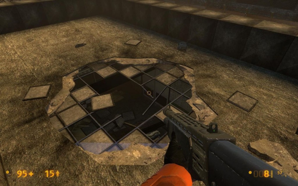
Differences in aspect are fairly easy to pull off to emphasize an element, but usually have to go along with environmental storytelling to have a logical place in the world. For instance, in an otherwise pristine environment, any damaged element will pop out, but you'd have to explain somehow how that thing got to be damaged, or risk breaking the immersion by having the player pick holes in your universe.
The direction and angle the elements of a scene are facing can be used effectively to create contrast. For instance, if the lines defined by the geometry and textures of a space are predominantly horizontal, introducing an element with noticeable vertical lines will make it stand out. Put the player in a graveyard with many tombstones standing straight up but a single one sunken down in the ground at an angle, and guess which one the player will investigate?
Shapes & forms
Shapes are areas defined by edges, whether geometric or organic. When building a level, usually its theme and the game's art style dictate the shapes and forms used in the environment, and often it remains coherent and consistent throughout. However, there is something to be said for breaking that rule and introducing contrast within those forms to draw the attention of the player. Shapes featuring different characteristics than their neighbors will attract attention.
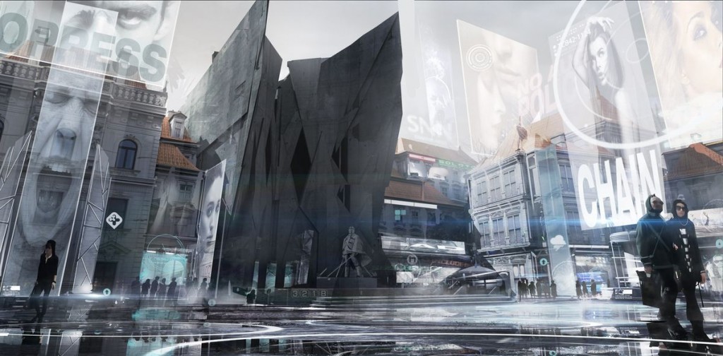
For instance, introducing a very organic element (like an oozing, pulsating goo substance) in an otherwise very geometric, solid-looking environment (e.g. a spaceship interior) will create a big contrast, as long as the two are not equally balanced. Natural elements in an otherwise very artificial setting have a similar effect (e.g. a small lush garden in the middle of a high-tech futuristic city.)
The same applies to the contrast between defined and undefined shapes (e.g. a lighthouse sticking clear and sharp out of a sea of diffuse fog), to exceptional vs. ordinary shapes (e.g. a crazy art sculpture in the middle of an ordinary building) and to shapes with opposite features (e.g. a circular pattern in an environment where everything is made of squares.)
Position & proximity
The position of an element compared to all of the other elements of a scene makes it appear more or less important than the rest. Usually this means raising the critical elements above others, but it also works to leave enough space between a subject and other elements, as isolating something usually emphasizes it. Use that to distinguish what's important from the crowd. The proximity of different elements can also combine their effects and become more powerful.
Motion
Motion in a still environment will create very noticeable contrast, and the same is true, to a lesser degree, for stillness in a dynamic environment (e.g. someone standing still in a crowd of moving characters). Rotating fans, swinging chains, banging doors, flapping curtains or flags, spinning or flickering lights are all common tricks used to draw attention.
3. Continuity
Since our medium is often 3-dimensional and dynamic, just drawing the player's eyes to an element is good, but more often than not we don't just want to encourage the player to look at a subject, we want both the player's view and movement to follow that subject or the path defined by the composition. We'll explore more games-specific ways of achieving that result further on, but composition already provides a great set of tools to create some of that continuity.
Lines & curves
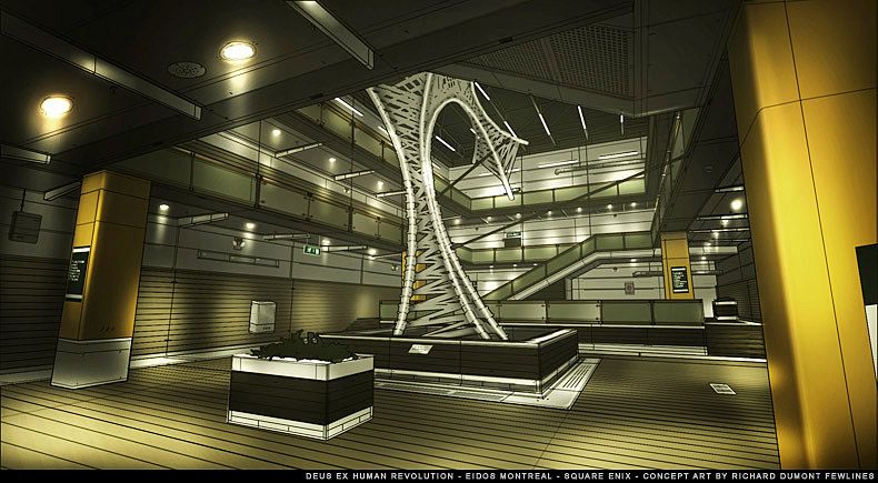
The most simple and subtle use of a line is to indicate a direction or define a path. But multiple lines can be combined for even greater effect: to create convergence, when the majority of lines point towards a particular point or space (the center of interest), and continuity, when lines lead into one another, working together to guide the eye along a path through the composition. Lines are very effective at pulling the player through an environment. They wield such power over us that it can actually be hard to ignore their instructions sometimes.
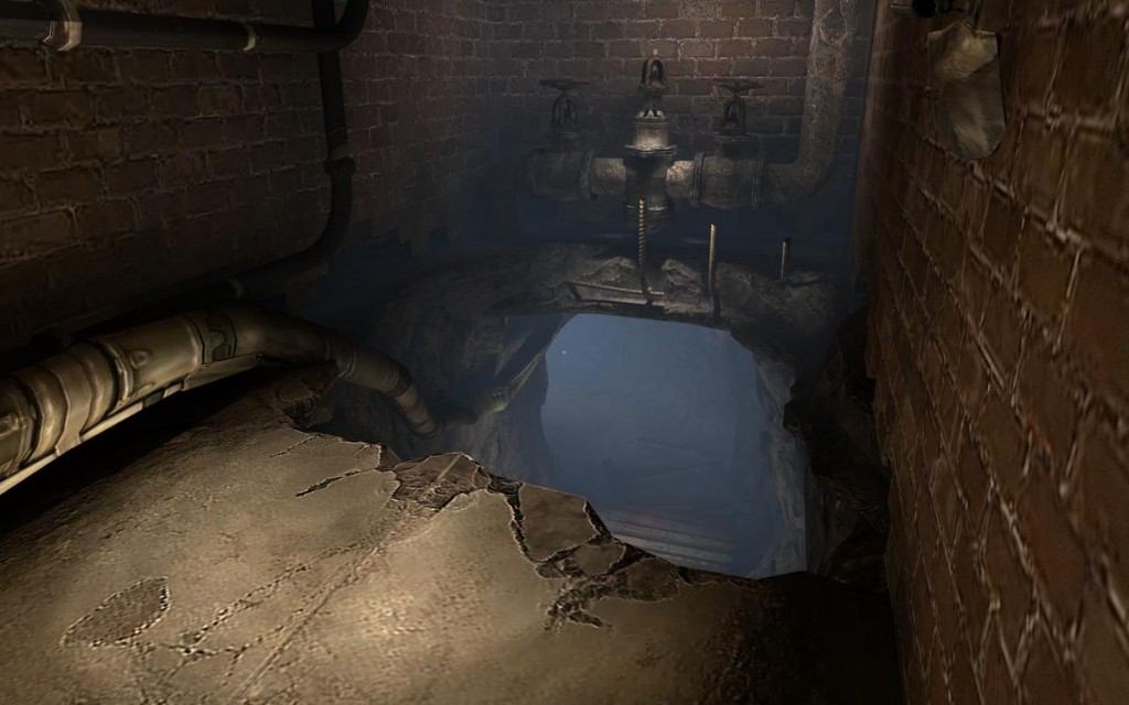
There are all sorts of ways to create lines in a scene, including the geometry and detail of the room, the edges and orientation of objects in the room (furniture, carpets, cover…), actual paths or roads, cables and pipes, lighting, decals, repetitive patterns, contour of contrasting elements, etc.
The tricky thing with dealing with lines is when you've got to make them work from multiple viewpoints in complex environments (e.g. in levels that involve backtracking, non-linearity, multiplayer…) As their name indicates, you can use lines quite heavily in linear levels, but they loose a bit of their power in non-linear/open-world environments, although elements like roads, railroad tracks, tall buildings… can still be very efficiently used.
Repetition & rhythm
Repetition is the regular disposition of similar elements. Its effect is akin to that of lines, because a series of similar elements creates continuity in the player's mind and tends to blend together as a line or path, each element of the repetition acting as a stepping stone in that path.
Rhythm is a repetition which alternates different elements. It's often a good idea to obscure the rhythm so it isn't consciously perceived.
These concepts are closely tied to contrast, since breaking a rhythm is a great way to attract attention toward the point of rupture. Consider the act of driving on a highway: the rhythm is composed of multiple types of repetitive elements, such as the markings on the road, the road signs, the bridges you often go under and the regular exits. The rhythm isn't completely obvious, but it still affects the driver: it can be fairly pleasing, but also boring if it goes on for too long, and people tend to drift into their thoughts due to the monotony. Now introduce a surprise speed-radar into the rhythm and watch them snap out of that trance.
Paths, trails & breadcrumbs
I feel that paths, tracks and all sorts of trails belong to their own category. Sure they are a special case of lines and/or repetition which can be followed through the environment, but they tend to become more effective than the sum of their parts. While lines and repetitions can remain subtle, paths and series of breadcrumbs are much more obvious, for better or worse. We are used to following them, even in our day to day lives, and they have an even bigger sense of continuity because we can safely assume they lead somewhere. And of course, they can and often should be reinforced with extra continuity or emphasis in the scene.
They are very effective at leading the player's movement in particular, almost acting as rails for him to follow. They can also lead the eye from one point to another, allowing the player to spot the most important element and then leading him to connect that to a satellite element (e.g. a cable connecting to the control panel used to open the big red door)
Links to unseen spaces
In most games, the first- or third-person perspective is too limited to really let players figure out if the corridor in front of them is elbow-shaped or a dead-end, so adding subtle confirmation that it indeed leads somewhere gives the player confidence that he's headed in a valid direction. It's also a good way to instill curiosity about what's around the corner, to keep the player moving.
This is usually achieved by creating a connection between what is visible to the player and the occluded space, for instance by casting light from the invisible space into view, or using lines and shapes that bleed between the two, such as cables on the ground or pipes on the wall that disappear behind the corner.
Motion
I touched upon motion to create contrast, but another property of movement is that it can define a direction as well, and can create a complex string of lines and curves that lead through a composition. For instance, a train passing from left to right of the screen will naturally make players look to the right to follow its trajectory, and a flow of water falling off a ledge will lead the player to approach it and look over the edge.
Stop & look points
It can be appropriate to break continuity on purpose, like perpendicular lines interrupt a road at stop-signs, to make the player pause and observe (e.g. vistas, critical scripted events…) or weigh his options instead of rushing in head-on.
Cover usually has this effect when placed at the entrance of a space: players will naturally be driven to that cover piece and stop there for a short while, giving them a chance to take in an event or complex environment. Vistas are also usually set up in such a way, so that when approaching the vista there is nothing in the proximity of the player clearly guiding him, until he's taken in the view and turns around, in which case the path becomes clear again.
4. Evolving composition
Finally, what's particularly interesting to me since it exploits the dynamic nature of our medium, is to layer compositions and make them evolve as events and gameplay take place or as the player moves through the space, so that their effect on the player changes.
Like focusing on a threat as the center of interest, then when that threat is defeated the next focal point in the composition takes over as center of interest and drives the player forward without having to tell him anything. For instance, a massive boss character will capture all of the attention until he's defeated; then the large gate behind him, which was highlighted all along but just less so than the boss, becomes attractive and the player immediately understands how to proceed.
Similar effects can be achieved by changing the environment as the action takes place, such as destroying cover and obstacles, changing the lighting setup, creating/removing hazards, changing the orientation of elements or lines, etc. Those features do not have to limit themselves to being cool effects and interactivity, they can turn a static composition into an evolving one that communicates different messages at appropriate times.
