The least intrusive tools of all ease the process for players to create mental maps of the environments they traverse. If they can get a general idea of how a level is laid out and know their current position, they can make educated guesses about where a given path leads. If they have built an accurate mental map, they can move around with ease and use advanced tactics.
1. Simplify
Build readable spaces
The key to allow mental mapping is to make it easy to abstract the layout in one's mind, based on an overview or a compilation of multiple views of the area. A good starting point is to create spaces whose high-level layout is easy to grasp. Players don't need to understand the full layout just by looking at a structure/area, but they can identify important details that help approximate its layout: rough size, amount of floors, overall shape, how it is placed in its surroundings, access points… Then whatever they see within that structure/area can be checked against the abstract overview to estimate where it is located, what it points to…
Those spaces usually feature:
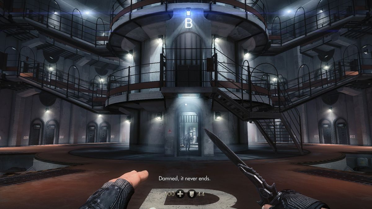
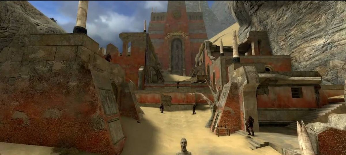
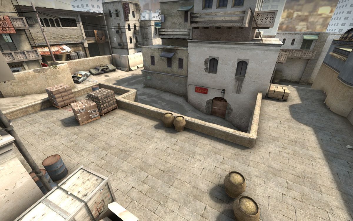
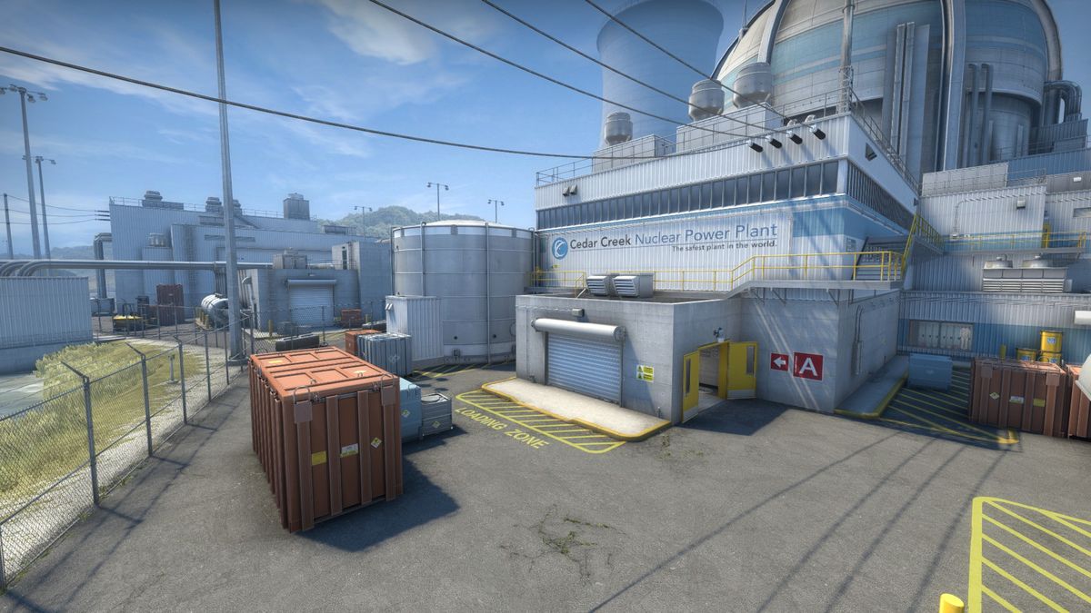
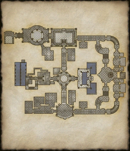
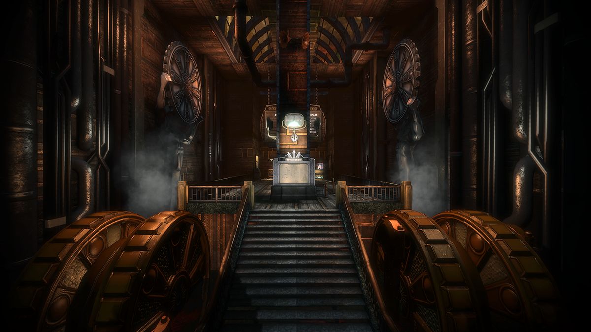
- Simple/geometric high-level shapes – Triangles, squares, grids, circles, hexagons… are all good starting points because they are easy to recognize and remember. This can apply to any level of scale: on the global layout of the level (a residential neighborhood built on a grid), the layout of an area (a hexagon-shaped government building), or the shape of a single room (a circular boss arena with a triangular structure in the middle.)
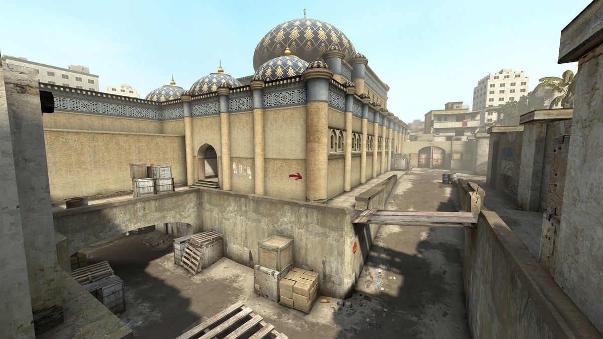
- Symmetry – Many such spaces use symmetry and central figures to simplify the shape of the area and provide one or more clear reference points. However, geometric shapes can be too symmetric, which can have its drawbacks. Symmetry along two axis can make it harder to orient oneself if there are no clear ways to tell the different sides apart. It's often better for orientation to limit a structure/area's symmetry to one axis, and to keep it high-level, so the layout is easily readable and the low-level geometry provides guidance and differentiation.
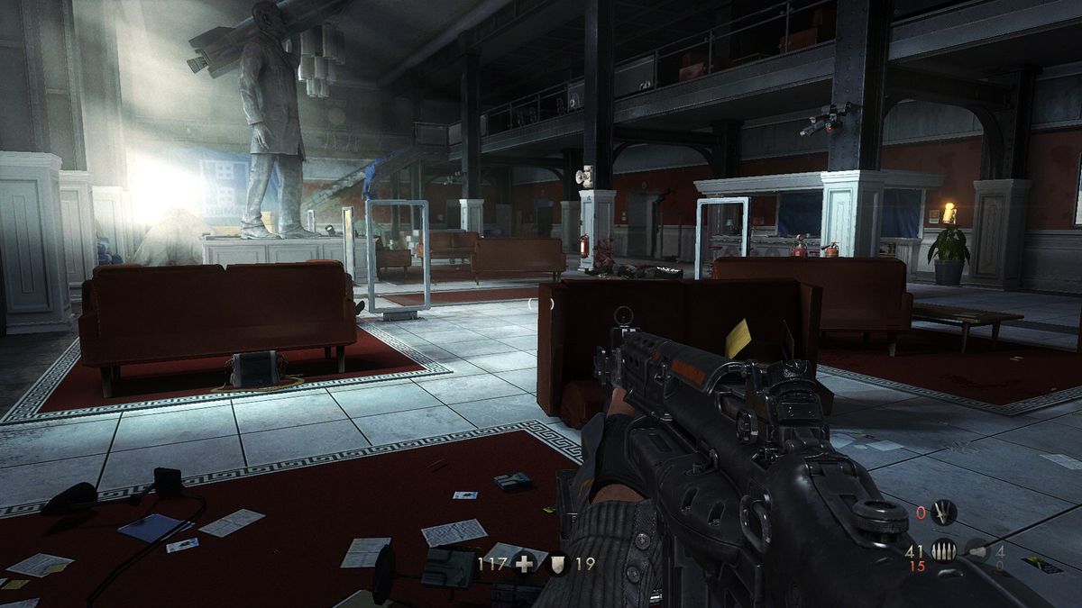
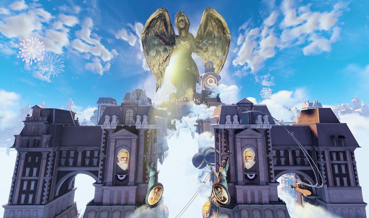
- Recognizable features – It helps to provide a few elements that can be recognized from any angle and point of view (e.g. central structure, high reference point…) I'll get back to that soon.
- Clear boundaries – The boundaries of an area are what help define its shape, so if those boundaries are fuzzy it also becomes harder to abstract.


Use familiarity as an advantage
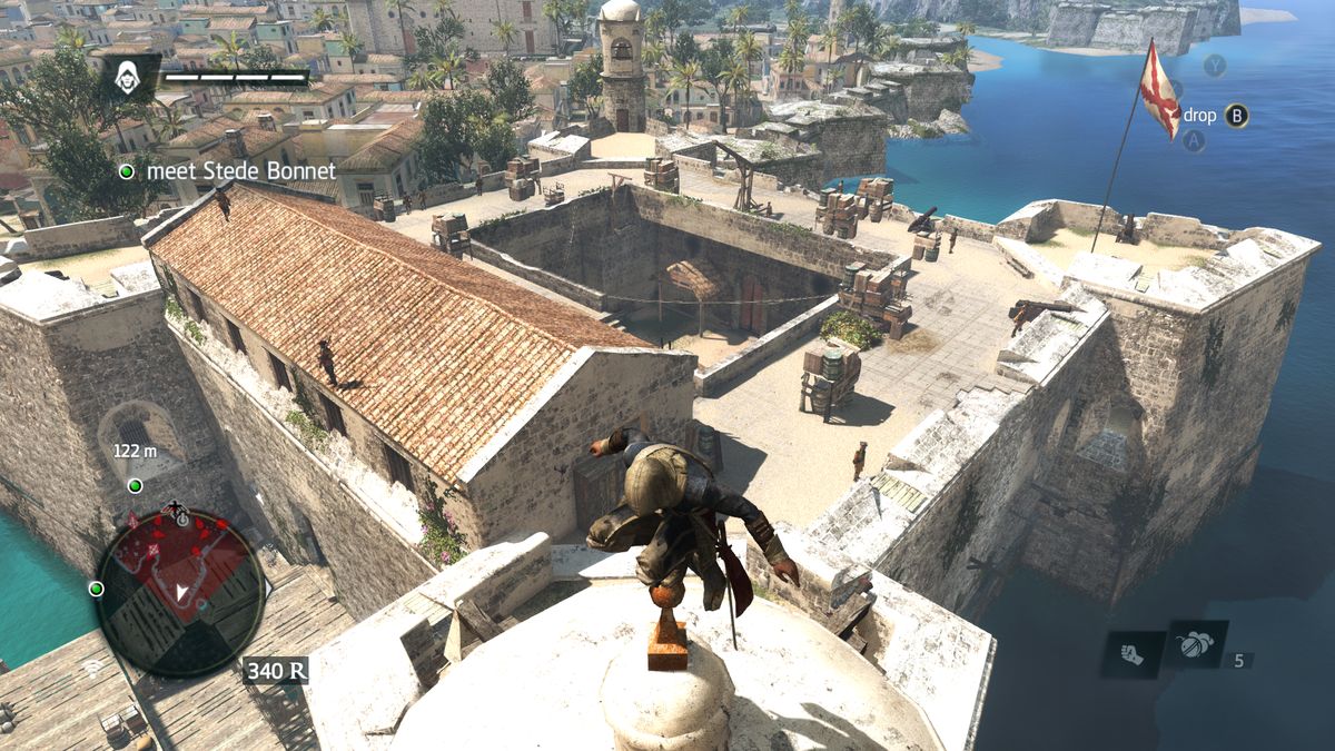
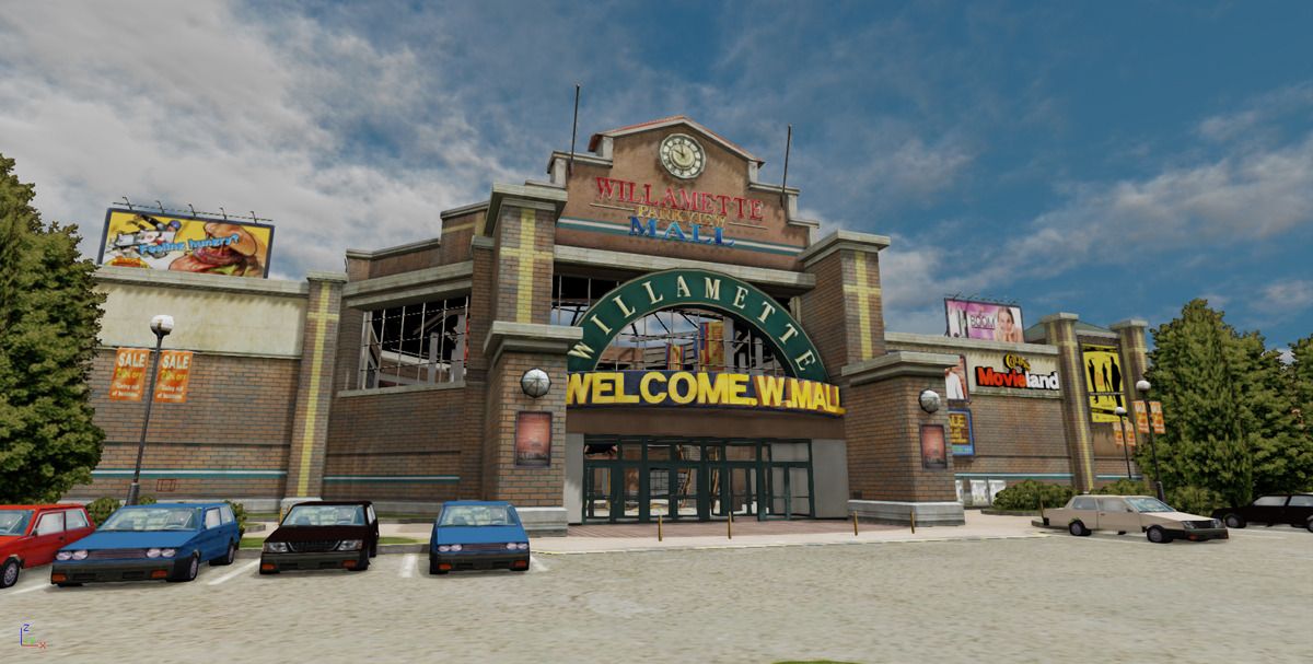
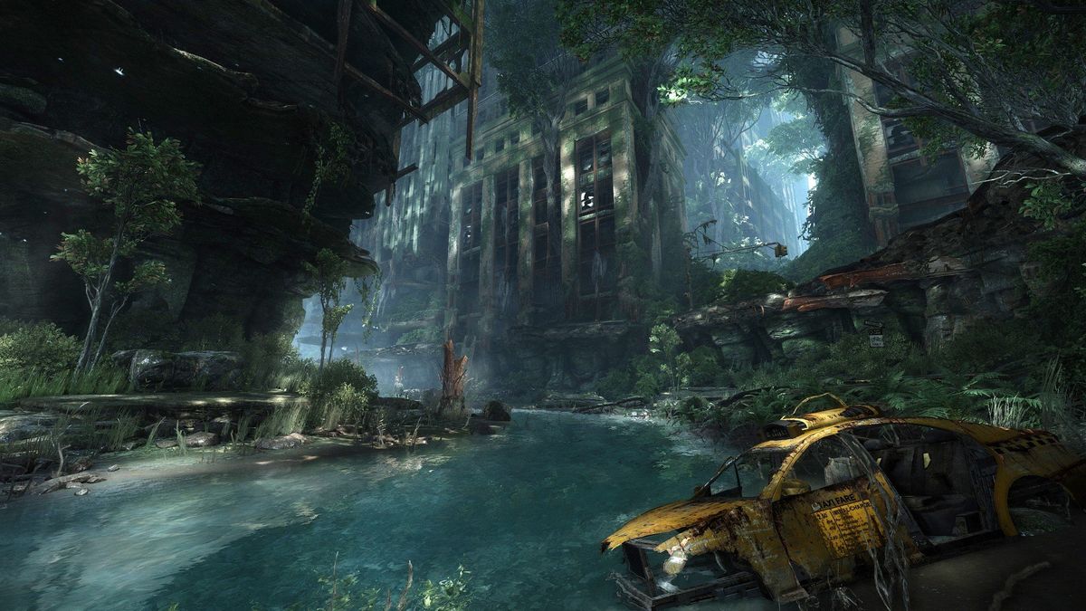
The same concept also applies to environments that we're fairly familiar with, or have a general understanding of. It doesn't mean one couldn't get lost within the twists and turn of a large conventional building, but some places come with a broad understanding of their layout or part of their layout, critical places or elements within them, etc. Stadiums, churches, coasts, malls, libraries, houses, theaters, swimming pools, hospitals… Not two variants of those locations have the same exact layout, but we are familiar enough with their purpose and components that we can grasp their layout much more easily than unknown or generic environments.
For instance, a beach environment has a set of characteristics that makes it easy to orient oneself: the ocean, then a layer of sand, then rocks and potentially cliffs, grass, and trees further on. Most houses contain the same types of rooms, and certain rooms always belong on a given floor. We know that the locomotive is located at the head of a moving train… You get the idea.
Reduce clutter, improve structure
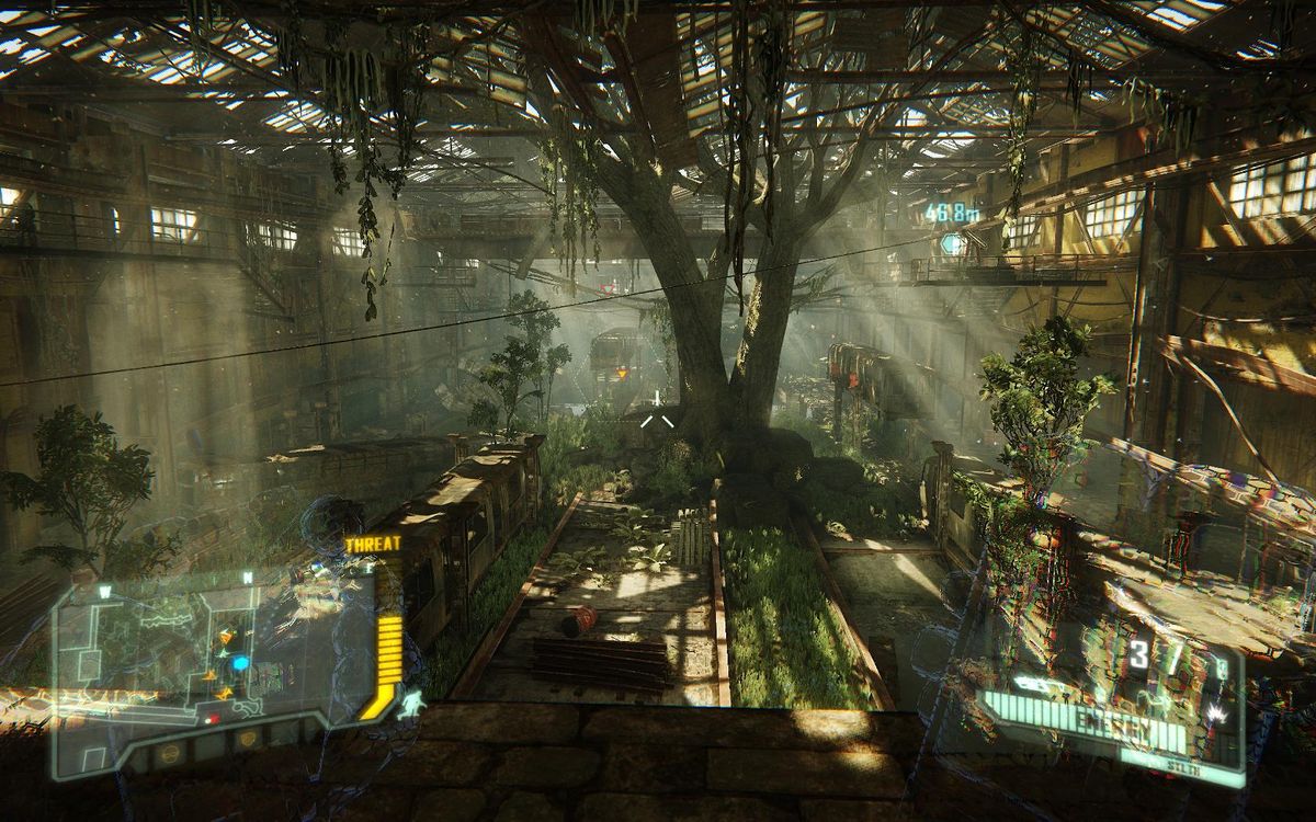
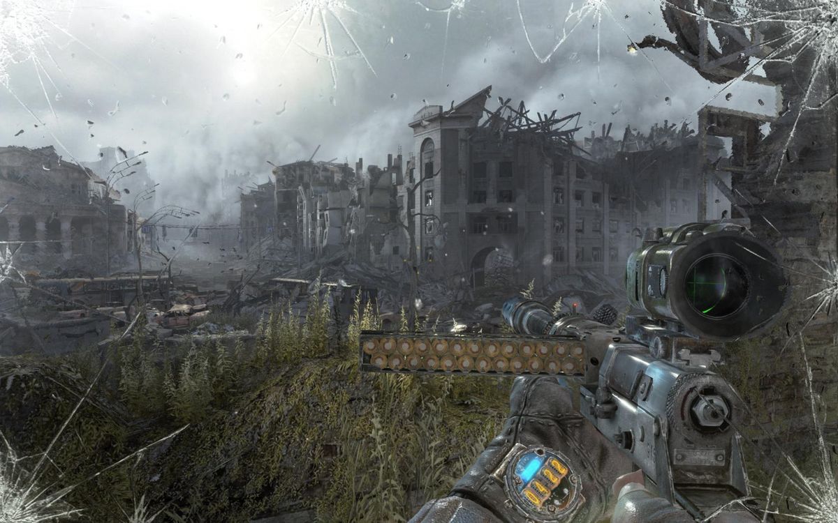
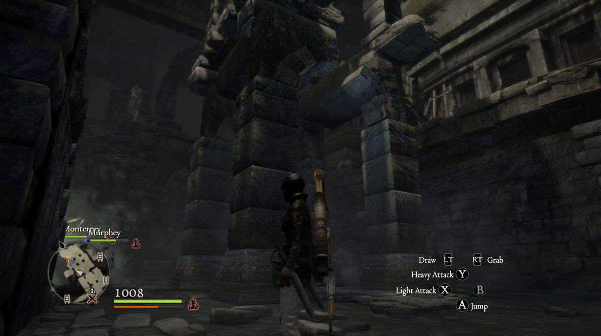
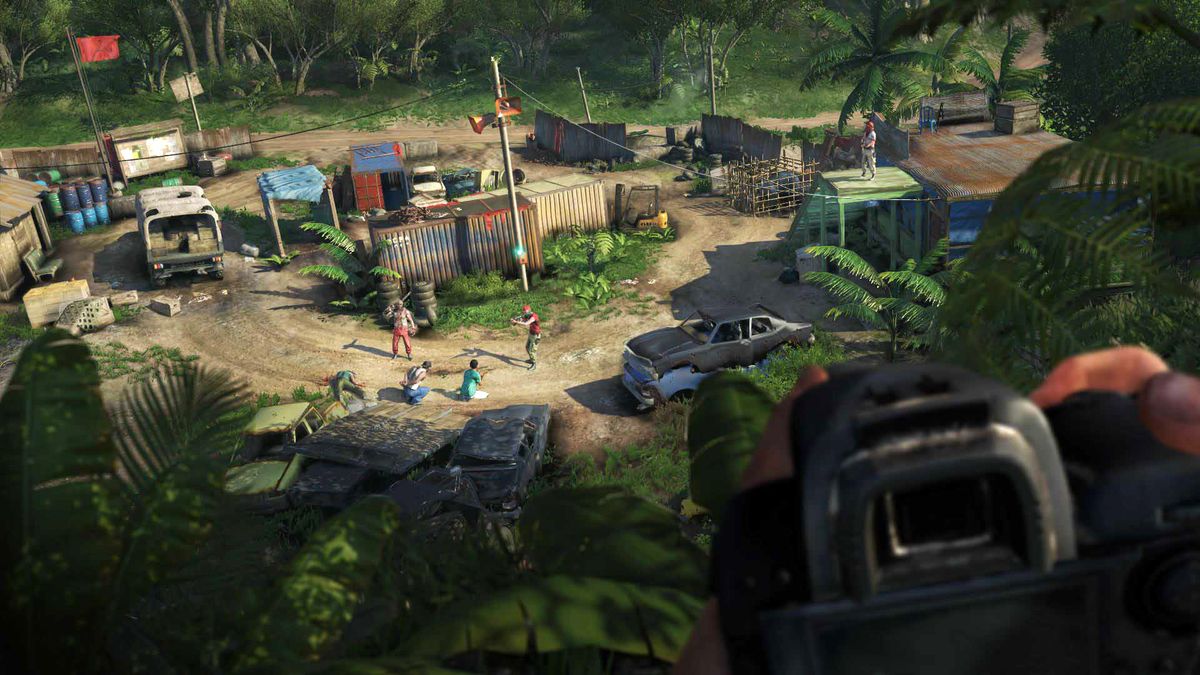
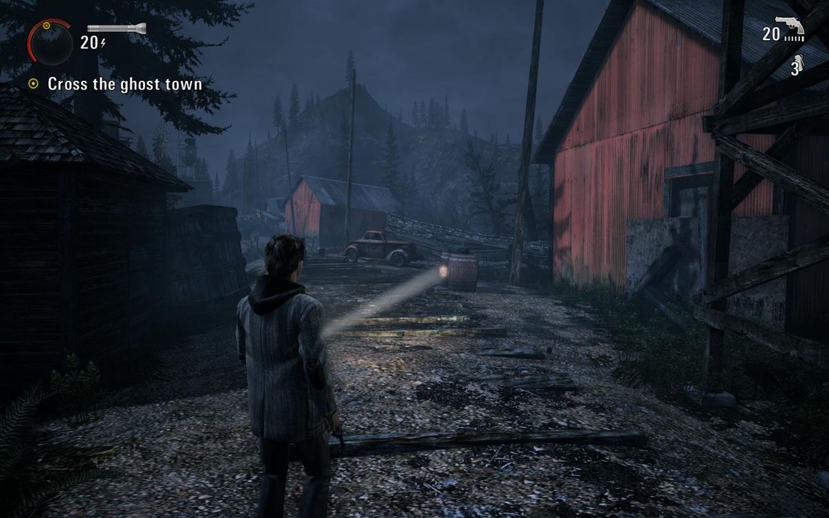
Too many props, obstacles, vegetation, alcoves, characters, light sources, too much architectural noise, smoke, movement… create a scene that is harder to take in. For everything that gets put into an area, a level designer should consider what is its purpose, and what impact it may have on the readability of the path or layout (among other things.)
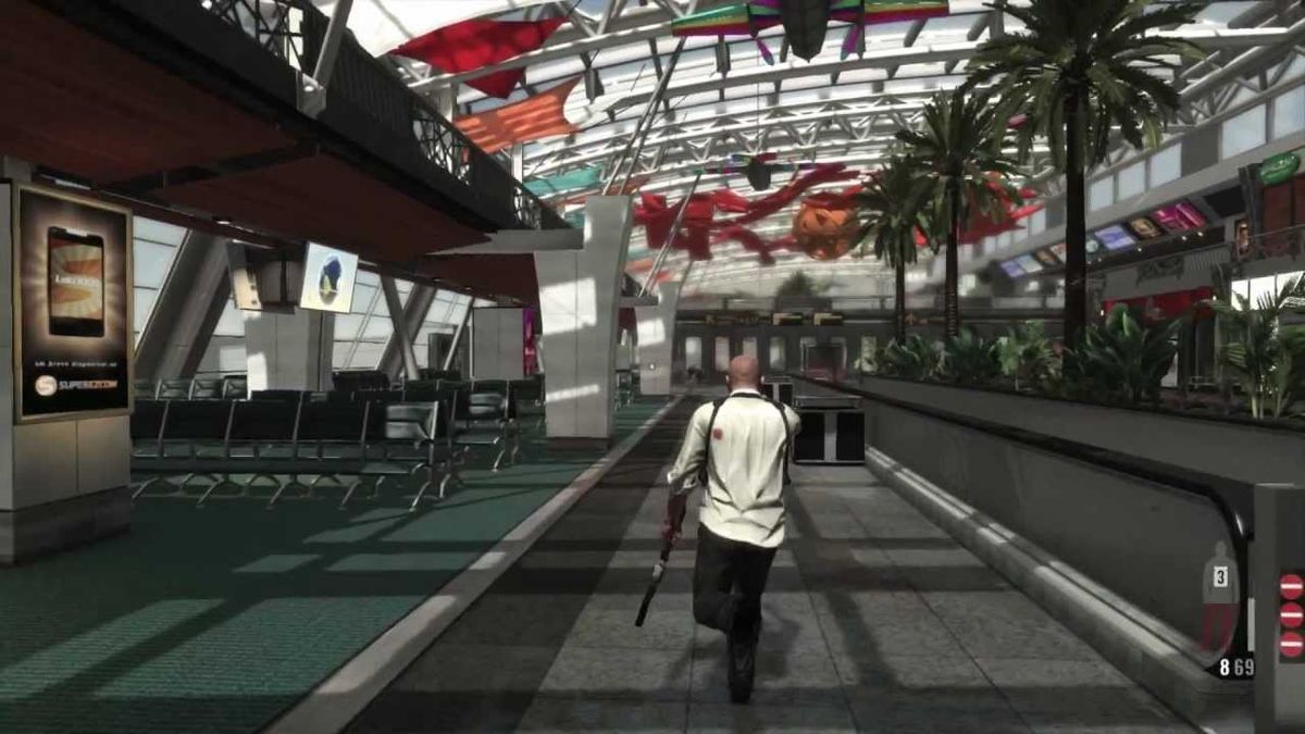
That doesn't mean you can't make detailed, complex scenes for your game; but usually the more you put in and the less structured it becomes, the more tools like UI markers or companion NPCs you'll have to rely onto guide the player. Levels in Mirror's Edge are supposed to be intuitive to traverse at high-speed, so architectural detail and props are stripped down to a minimum; but series like Hitman or Assassin's Creed can get away with heavily crowded environments because they use UI markers, maps…
For example, it is often a good idea to group props and cover elements together, so they create patches of occlusion that are more readable than haphazardly placed objects. When placed on the sides of the path rather than in the center, they also blend better with the edges of the environment and affect less the complexity of the scene as a whole.
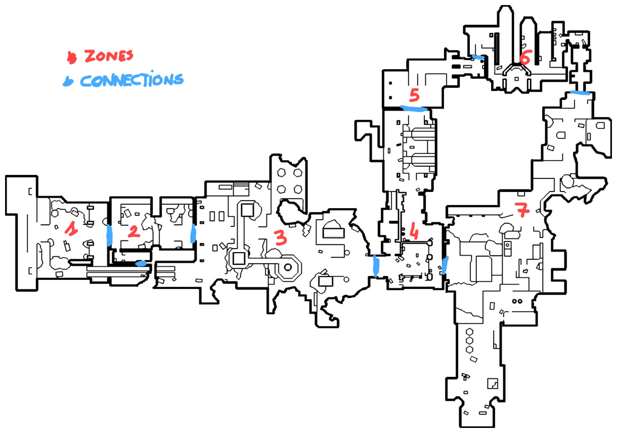
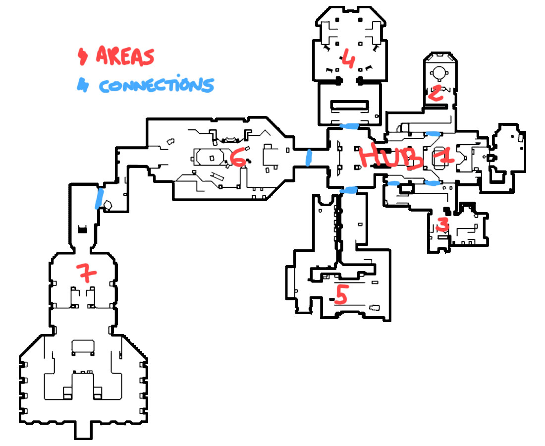
Limit the amount of interconnections
While it's generally also a good idea to limit the amount of connection points between two areas, I'm referring here to limiting the amount of areas directly reachable from any given one. Too many ways to traverse between areas makes it hard to mentally connect them together, to remember where each path leads, how to get somewhere quick… For example, a set of areas all connected only to a central HUB will be much easier to deal with than if each area also connects to all of its neighbors and beyond.
Limit twists and turns
The more corners the player has to turn, the more he will lose track of how his current position relates to the last places he visited. If he has to go around five elbow-shaped corridors before reaching a room, chances are he has little idea how this room spatially relates to the one he was just in. Be careful to only create mazes by intention, not by accident.
Of course this only applies to cases where the player does not maintain an overview of an area: zigzagging around low walls, see-through fences, vegetation, catwalks… while keeping the exit in view most of the time wouldn't have the same potential to get the player confused. That's actually a common trick to make more extensive use of a single area.
Follow conventions
Extreme examples of navigation conventions would be side-scrollers that ask of the player to keep moving towards the right side of the screen, or shmups that point him up and prevent him from going backwards.
If the genre your game belongs to has navigation conventions, using them can greatly simplify your job (although breaking/twisting them can help make your game unique.)
2. Compartmentalize
Use themes
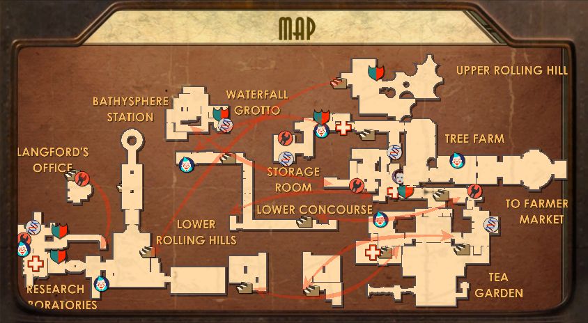
At every level of scale (world, level, area, floor, room…), clear themes help differentiate locations from one another and allow players to attribute unique memory slots to each. Ideally, players should be able to pinpoint their location by just narrowing down on the theme step by step: "This is the forest level, I'm in the lumberyard area, in the kitchen of the workers' living quarters", "I'm in the poor district, on the edge of the canal, in the black market."
This is not often cheap in terms of unique art assets required, but themes do not necessarily have to rely on extra assets: if you have to be economical, they can be conveyed instead through mood, wear & tear, lighting, predominant colors, environmental storytelling…


Use unique connections/boundaries
Both connection points and barriers between areas benefit from being somewhat memorable.
Recognizable connection points act as mental breadcrumbs when planning a route to a destination, so a sequence of intentions can form in the player's mind: "Ah yes, I must first go under the massive arches with ivy on them to get to the garden, and from there I cross the bridge over the canal to get to the manor."
When used properly, the separators between two areas can also increase the player's sense of orientation. Splitting two sides of a village with a small river in the middle can make it easier to map out, although you would still ideally differentiate the two sides (e.g. put a landmark on one side). Splits such as interior/exterior transitions, height variations, roads, walls… can all work depending on the context.

Differentiate playable areas from background
If you manage to make it fairly clear what is background and what belongs to the current playable area, players who get the distinction will intuitively not care about mapping the background and focus on what matters. It's okay to have a super rich and complex background, as long as players understand they're not supposed to take it all in here and now.
That's commonly achieved by using such things as height variation ("It's too high, I can't get down there" or vice versa) and other blockers ("No way I can go through that acid pool, or those nasty-looking thorns"), narrative ("The mission is limited to this camp, no point trying to go beyond those tall fences"), lack of anything really luring the player to the background ("I could swim anywhere in the ocean, but there's just nothing pulling me to."), difference in scale between the playable area and the background ("There's just no way I'd travel that far since I can't drive vehicles or sprint very fast, it'd take hours to get to there").

Peel layer after layer
Another way to make a complex environment easier to grasp is to reveal it bit by bit. For instance, limiting the playable area at first and expanding it as the player gets things done, or opening shortcuts between rooms of a linear level to make it more open and all areas inter-connected. Give a chance for the player to map out your environments progressively, by unlocking parts of it one by one, to make it a less daunting task.
For example, an environment filled with a hazard like lava, acid, gas, water… limits exploration to one floor, allowing players to understand its layout. Then something the player does to progress clears the hazards (lowers water, cools lava…) and opens up the other floors and paths. The environment might have been a mess to find one's way around if everything had been presented openly from the start. The same applies to acquiring clearance to enter new areas, unlocking a mechanic that grants access to new parts of areas (e.g. Zelda)…

Communicate when a page is turned
It is a good idea to regularly let the player know that the mental map he is keeping track of can be shelved. Loading screens are a clear-cut example of this, but it can be achieved via back-gating (e.g. dropping from a high ledge, a bridge collapsing…) and works best when combined with a transition to a new area/theme.
For example, if the player has built a mental map of a castle, and he steps out into the courtyard and shouldn't have to care about the castle anymore because the link between those two areas is cut, it would be ideal if it could be subtly communicated to him, via the narrative or an event that prevents immediate return (e.g. the massive doors are closed and barricaded by the defenders) so that this mental map can be shelved, and a new one begin.
Players have become used to doing this, and it happens somewhat automatically at critical points like boss-fights, travels to distant locations, transitional cut-scenes, fades to black… but also when the game consistently avoids any backtracking or branching and players figure they don't have to put in the effort. Just be aware of how much the player is trying to keep in mind at once, and try to ease that burden if you want to get away with more secluded but more complex areas.
3. Connect
Connect physically
Establishing a visible physical connection between multiple paths and areas cuts down on the work for the player because he can grasp parts of the layout at a glance instead of through compiling the results of exploring each path. Those allow for "Ha! That's how I can get up there!" moments, by just presenting connections between spaces, or clear paths through spaces.
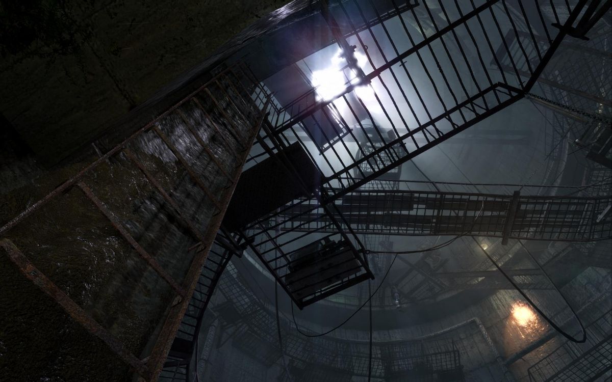
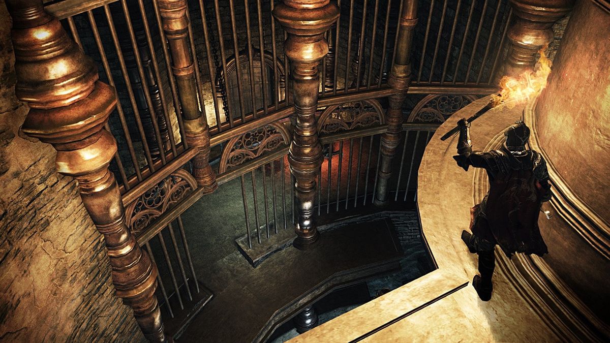
Walkways, platforms, scaffolds or open stairs are elements that allow a complex layout to be understandable because they do not obstruct much of the view and let players trace a path through the environment. Vantage points also help map out the layout of an area before getting down into spaces relying more on abstraction, spatial awareness and memory. This is where removing clutter helps a lot, because with too much in the way or battling for attention, it becomes hard to see those connections and paths clearly.


Connect visually
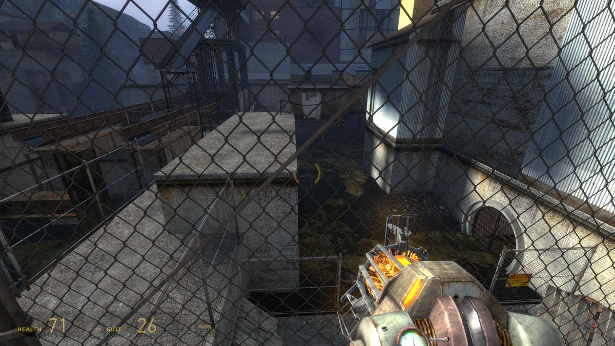
Connecting areas visually but not physically is a great way to make a level feel large and complex but very simple to navigate, and a common way to do that is seeing future/past playable areas via see-through obstacles (unbreakable glass, fences/barricades) or beyond differences in height, deadly hazards, openings too narrow to go through… This can give a great sense of continuity to the journey; a game can feel much less linear when it doesn't feel like the world is made of a series of corridors, but instead of twists and turns in a large and complex environment.
There is another side to this point though, which is to tie things together visually so they end up connected mentally too. For instance, the player finds himself blocked by a massive red door, and must explore the level to find a way around it. When he finally reaches the room on the other side, that red door acts as a link between the room he's now in and the place he left a few minutes ago, connecting the dots in his mental model of the level.

Connect mentally
When exploring an unfamiliar building, most of us naturally keep track of the amount of floors we have gone up and down to calculate which floor we are currently on (especially when there are no signs or points of reference available.) This is something that can be useful to consider in level design as well. For example, this means that it's sometimes better to split up two flights of stairs (e.g. putting them at both ends of a hall) so it's easier for players to remember how many floors they‘ve gone up, instead of letting them just climb a super long staircase and lose count.
This is even more critical when players already have a goal but don't know exactly how to get to it, such as seeing someone call for help from the 3rd floor of a building and having to reach that room. In that particular example, it is also important that the exterior of the building match the interior, so floors counted on the outside reflect how many floors you have to climb.
Another way of establishing a mental connection is to share elements between multiple floors or areas. For instance, two rooms, one above the other, that have the same basic shape and massive recognizable pillars in the same spots indicate to the player that those two rooms are directly above one another, even though he may have failed to figure that out because the path from one room to the other is complex, full of twists and turns and ups and downs.
Use persistence
Persistent consequences to the player's actions, such as decals, broken objects and debris, dead bodies, open doors, lit torches… are effective at reconciling what the player sees in the world with his mental map, by communicating that he's been here already and reminding him of what he did.
This is mainly applicable to non-linear or bi-directional levels where backtracking happens regularly, but can also be used to limit the chance of the player getting lost by not realizing he's going back where he came from. It can also help recognize visually-connected areas if he can spot traces of his passage beyond fences and other blockers.
4. Create a sense of geography
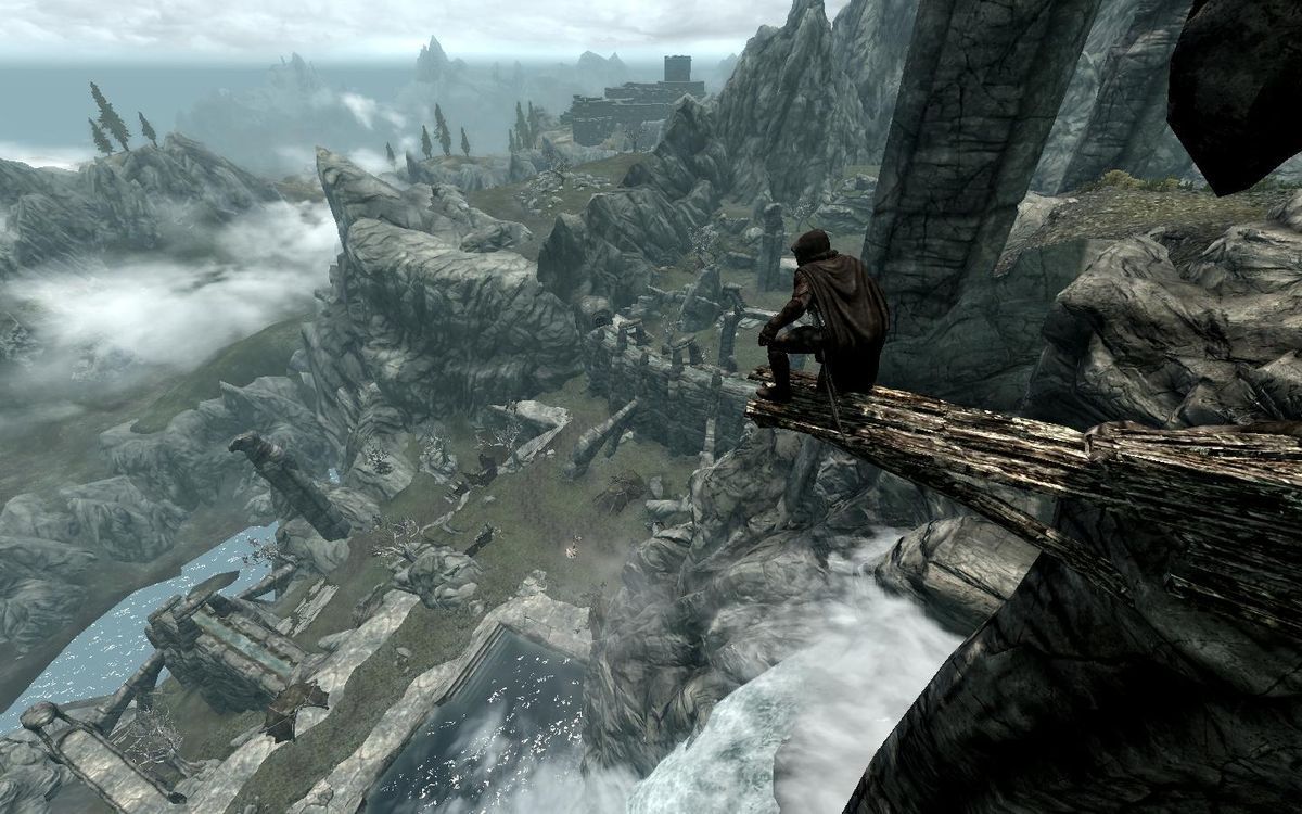
Vantage points & overviews
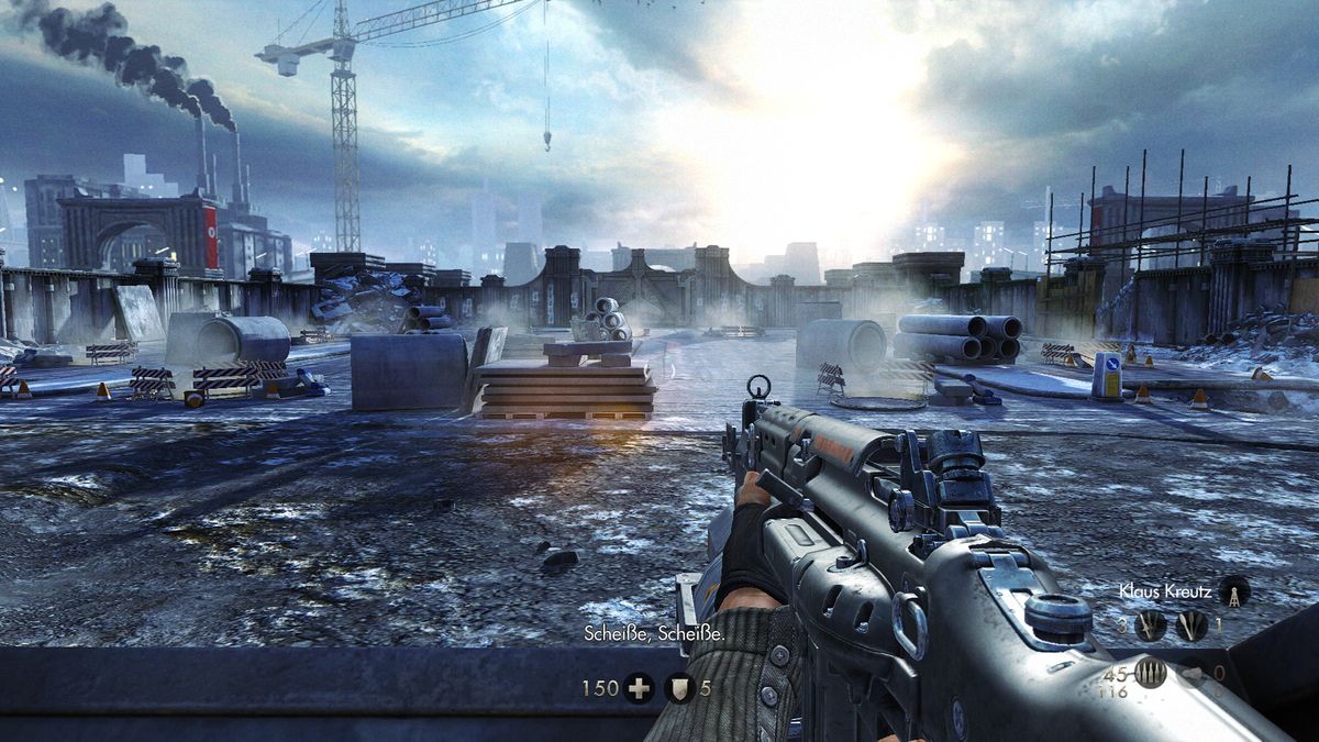
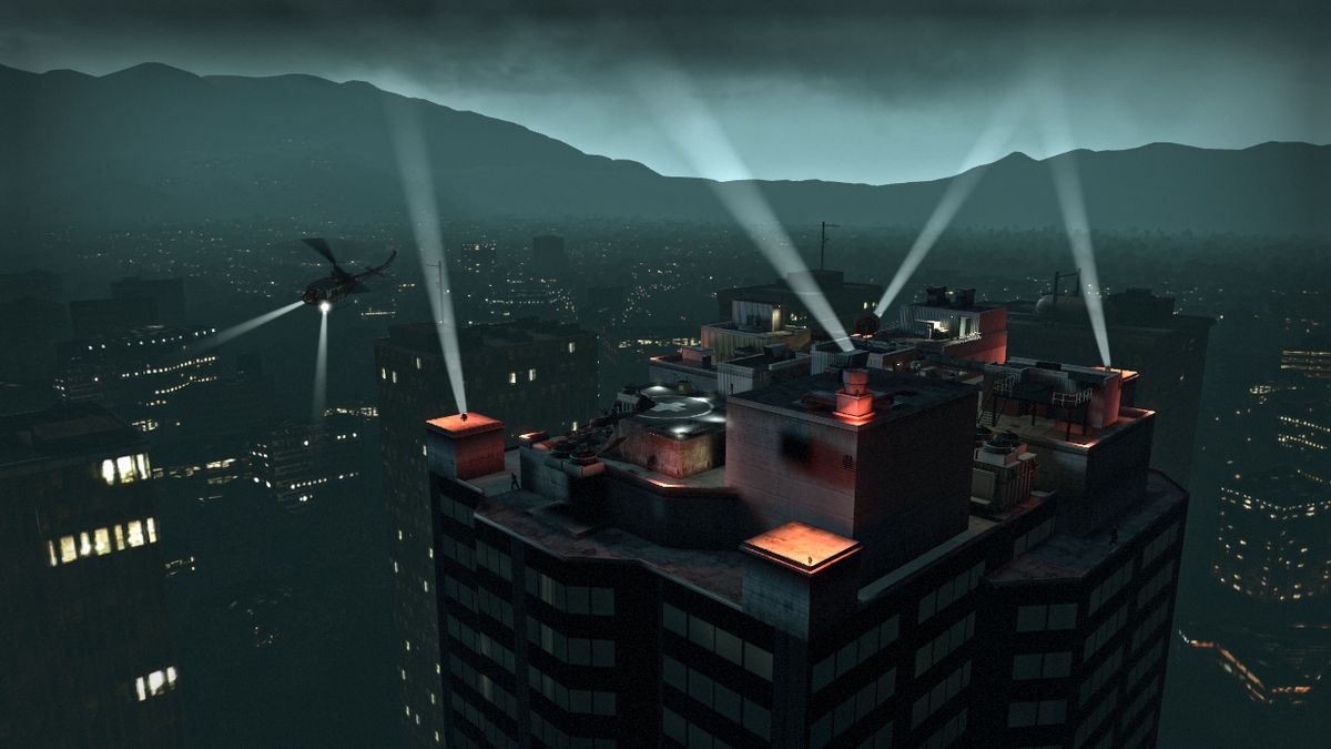
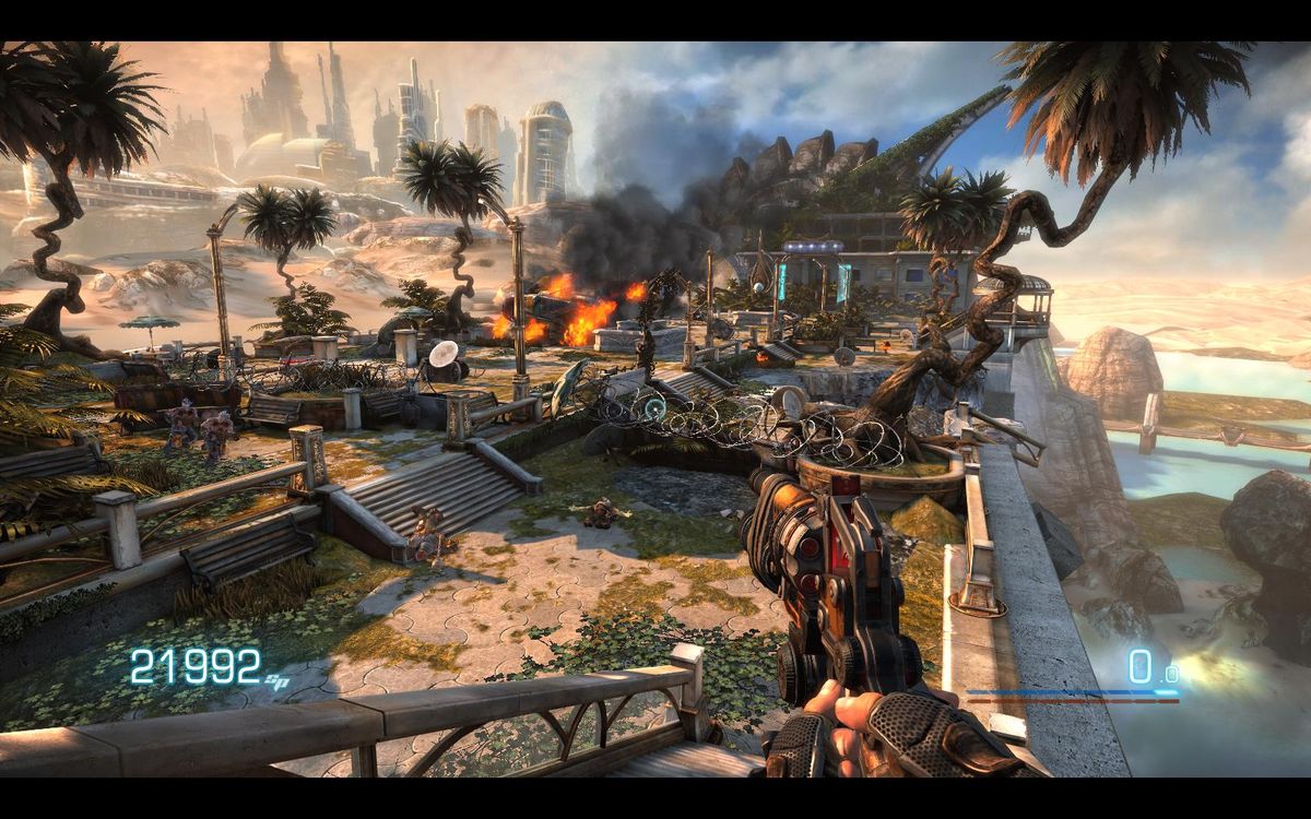
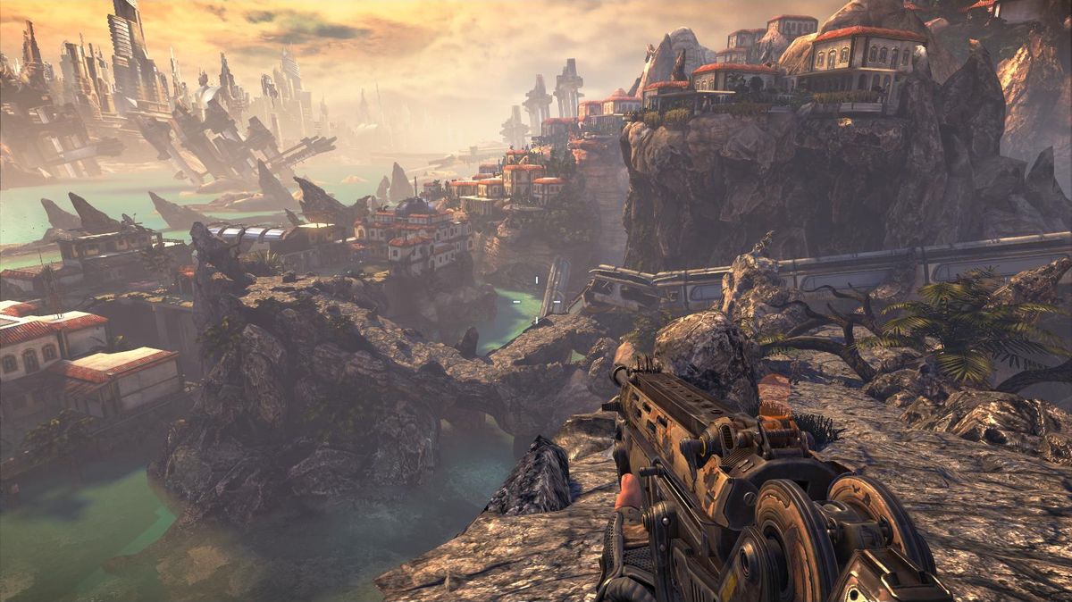
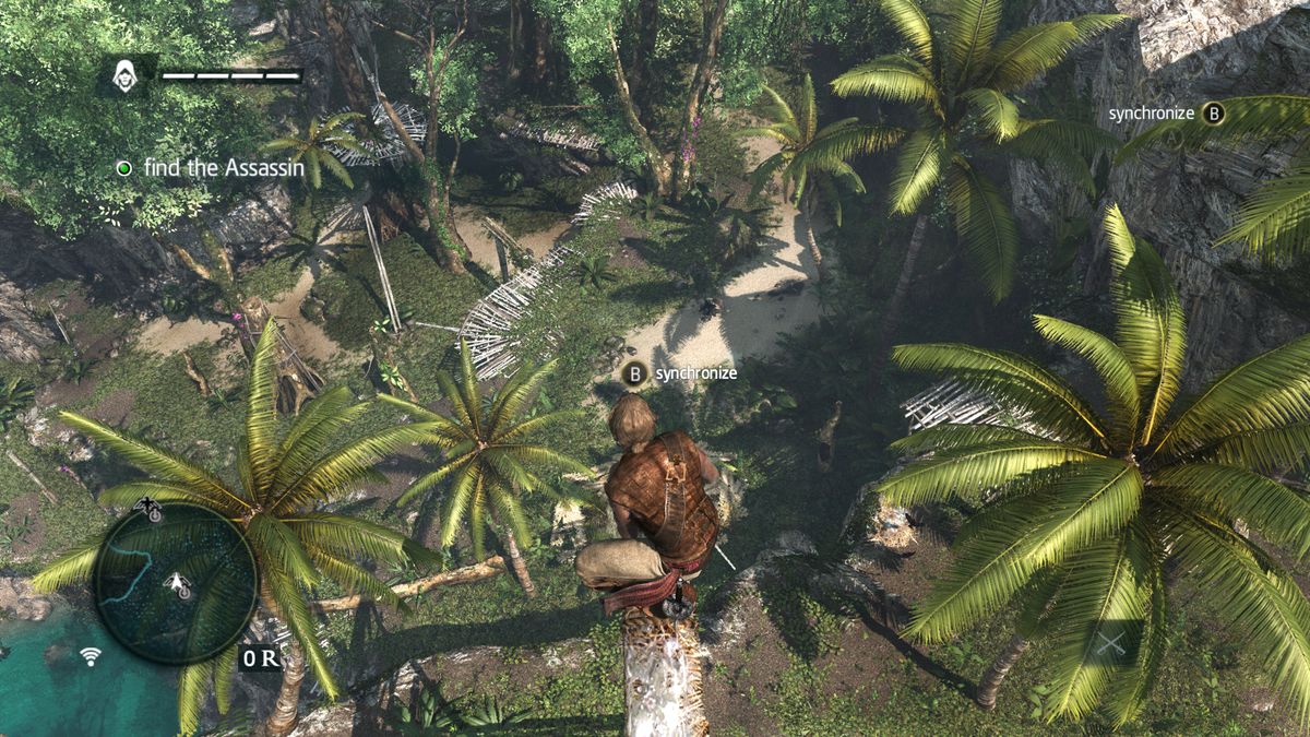
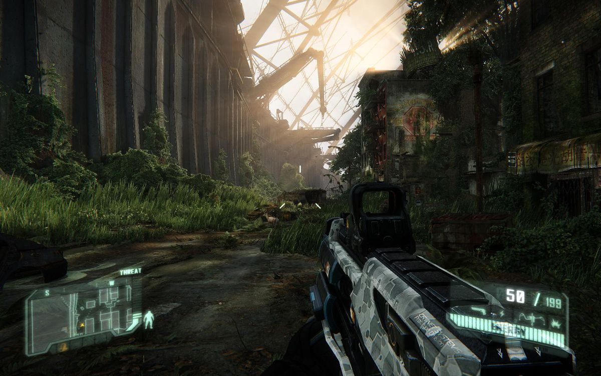
Part of the difficulty of orienting oneself in a complex environment comes from not having an overview of the layout. Providing those overviews goes a long way to connecting areas in the player's mind and building chunks of the mental map for him. Vistas are great opportunities to communicate as much information as possible, and they are often placed at bottlenecks that you can really compose effectively.
High viewpoints also generally allow better depth perception and thus give a good sense of scale and distance between locations; a phenomenon that can be extended upon by cleverly placing scale references within a vista. It is important of course to make sure the view from those vantage points is readable so players can process it. Showing a landscape of identical rooftops or forest treetops does little to help the player map the place, and if the visual guides are too clustered or overlap, it's the same deal.

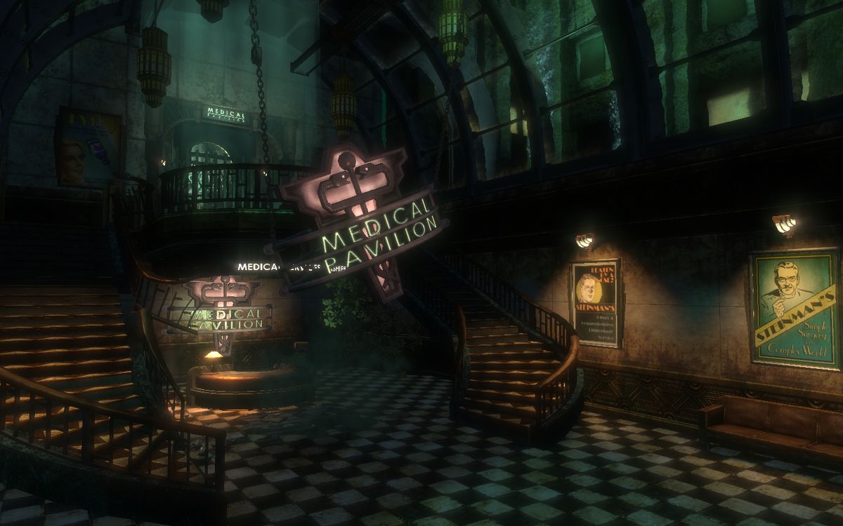
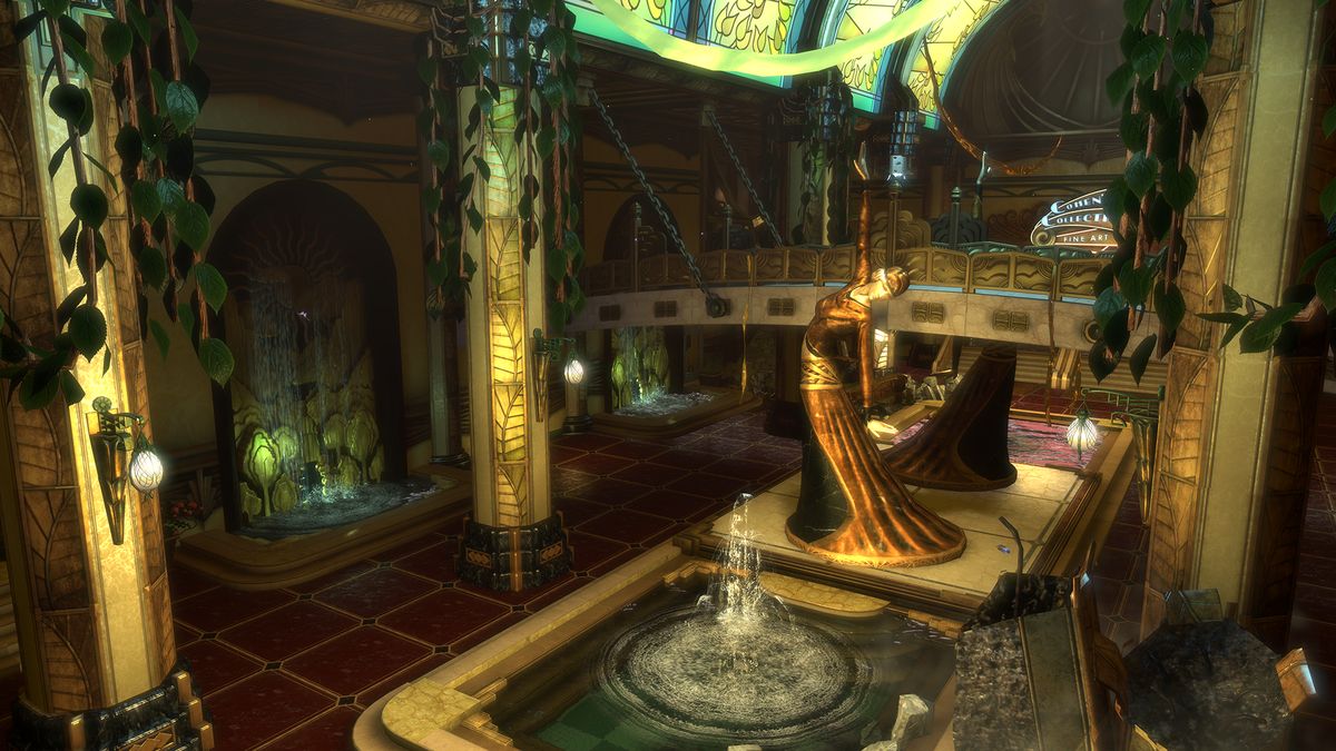
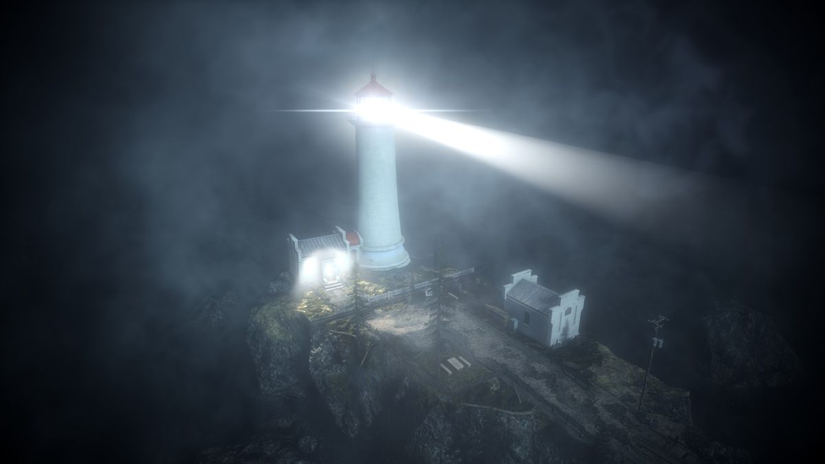
Landmarks
No matter if you can eventually reach them or not, or if they're part of the narrative or not, landmarks are very effective to let players build and update mental maps. They are especially powerful when combined with vistas, because they can act as links between what the player takes in at a vantage point and what he experiences afterward when he can no longer rely on that overview.
Even without vistas to highlight them, landmarks can still do most of the leading work for you, as long as you point the player at them one way or another (objective, narrative…) For indoor levels, landmarks observed through windows can be great tools to help, for instance, figuring out which side of the building the player currently is on.

Other reference points
Reference points do not have to be as massive and obvious as landmarks to work though, anything that helps players orient themselves is welcome. Breaking symmetry by introducing differences between the two sides of a room for instance helps give a sense of direction. A square room with two doors at opposing ends will give little to the player to work with; add a set of windows one one side with sunlight shining in, and players can use that as an orientation guide ("the windows were on my right when I entered, so that means this door is the way forward".)
The trick with those reference points is that they have to stand out enough to be noticeable, but most of them should remain on the fringes of the player's attention, so he can intuitively use them to find his way around without getting lured away from the main path or distracted. We'll get to that in the next part, when bringing up contrast and composition.
Another kind of reference is related to the overall structure of the environment. For instance, if a village is built on a slope dipping towards the sea, it becomes intuitive for the player to know whether he's getting closer to the sea (down the slope) or heading inland (up the slope). A flooded cave will be easier to mentally map if the water level is the same in every chamber, so it acts as a reference for how high/low the player has climbed.

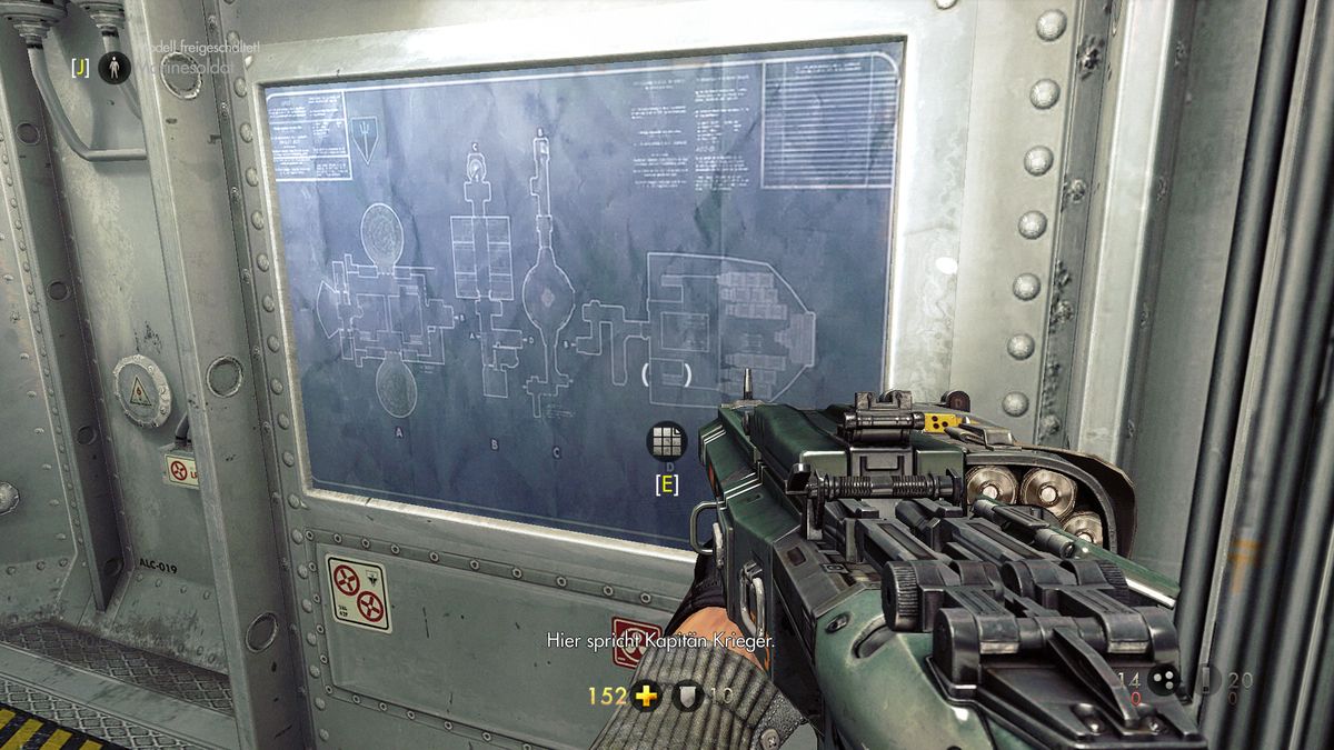
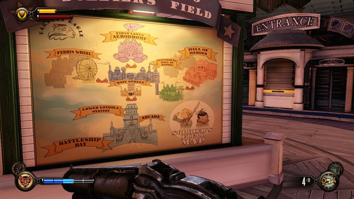
Embed the map in the world
This refers to 2D or 3D maps that can be inspected in the game world, like an emergency-exit floor plan in an office building, a 3D hologram of the whole spaceship's interior found in the bridge area, or the map of a public park carved on wooden boards along its paths.
Those maps can usually realistically only tell the players where he is, but not pinpoint destinations, so they can help to visualize and memorize the layout but rarely to plan a route to the destination. Don't expect them to save a level's navigation, but they can provide an extra tool for players to orient themselves, and can encourage the player to dig a bit into the world to find his answer rather than opening a map overlay. You can be clever with it though, and it works better when using clearly themed areas which are reflected on the map itself (e.g. labels that match places you visited or the description of your goal, dominant color of each area visible on the map, icons indicating the function of each building…)
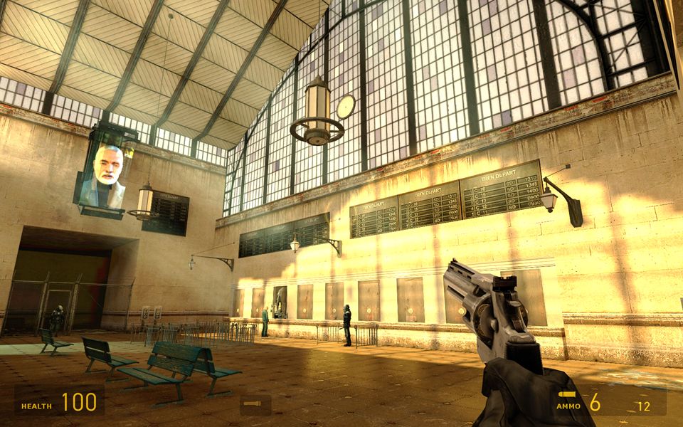
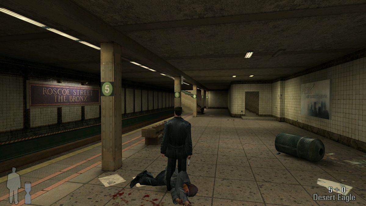
Another way to put the map inside the environment is to use signs and labels. Like in the real-world, labels and signs can be useful to describe what an element or area's purpose is, and where a given path leads. However, it's not uncommon for games to have labels and signs in the environment that do not really have the purpose of guiding players, so unless the sign or label really stands out, it's dangerous to rely too much on it. For instance, the arrow on a sign will often be more powerful than the text it features, because the arrow is intuitive and indicates a direction, whereas the text may be lost with all the graffiti, billboards, etc. littered around the environment. Also icons can communicate more efficiently the purpose of an element than text labels.